InterVarsity Staff Conference, January 2020
Concept & Design: Laura Li-Barbour; Animation: Matt Kirk
Longing for Revival
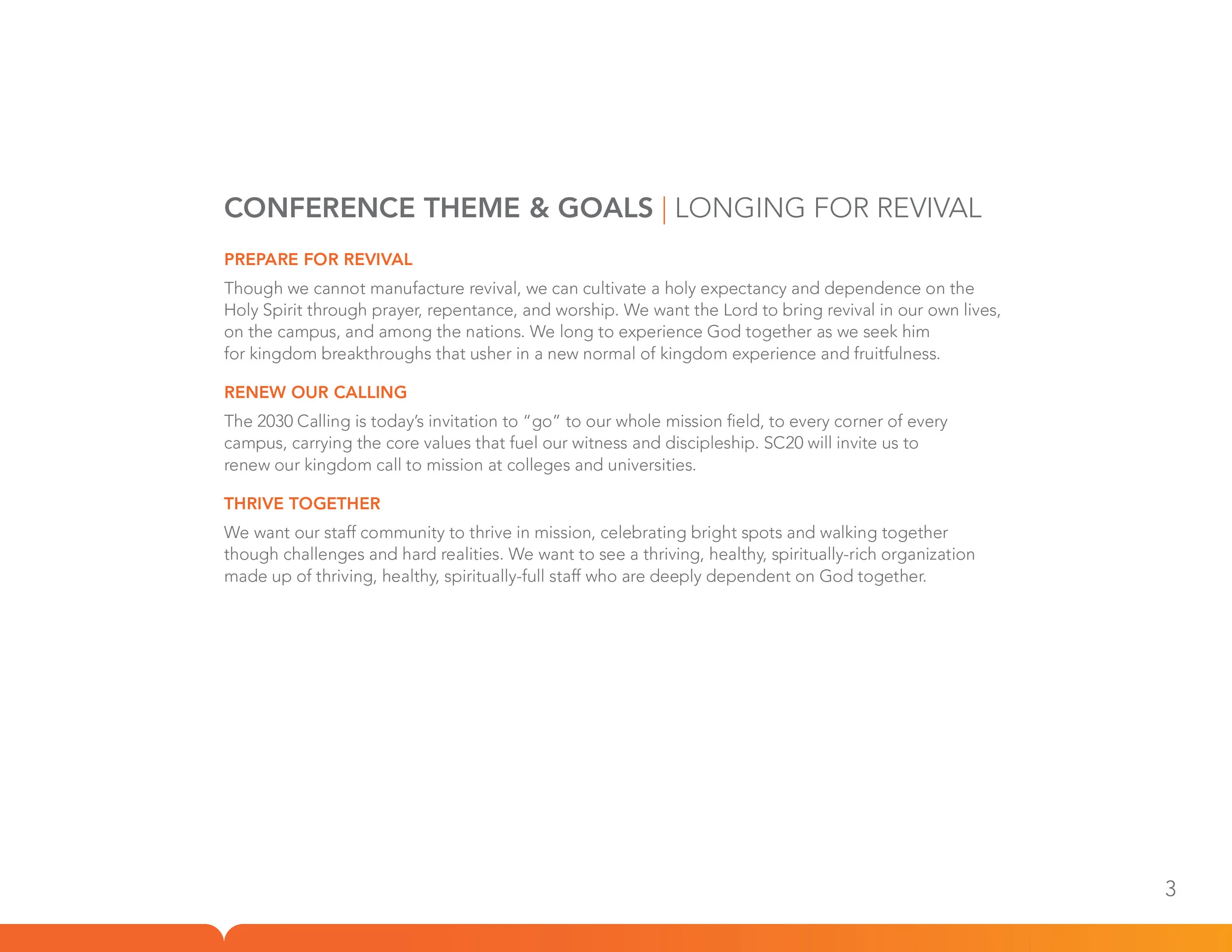
Every three years, all 1600 of InterVarsity’s staff gather for Staff Conference, where we learn, pray, dream, and grow together. This year, our theme was taken from InterVarsity’s 2030 Calling, which begins with the phrase “Longing for Revival”. My job as lead designer/art director was visualizing this theme in a way that would inspire staff and provide a meaningful experience.
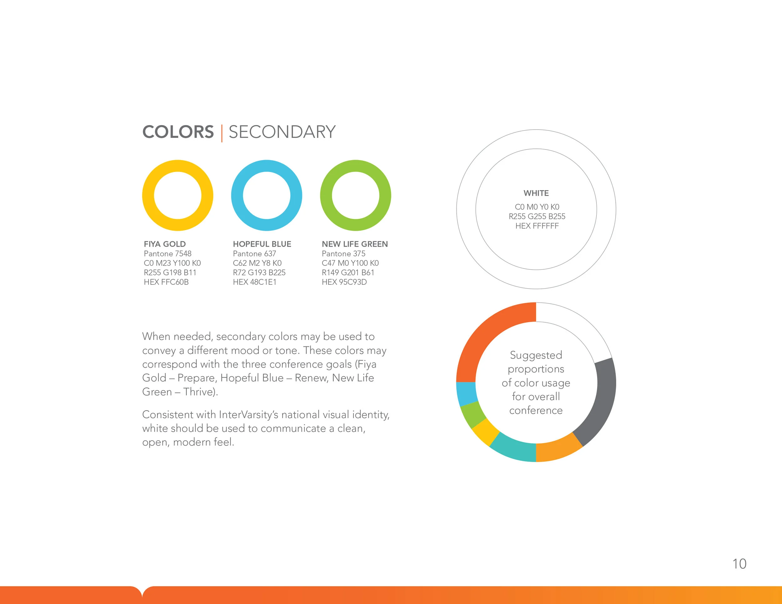
As this was also the first staff conference since InterVarsity’s rebrand in 2018, we wanted the visuals to tie in well with our brand identity.
After the research and ideation process, the design team proposed three concepts to the conference directors, who ultimately chose the “neon” concept. See below for further explanation.
Art Direction: Laura Li-Barbour; Designers: Laura Li-Barbour, Paul Lee, Courtney Herwicz, Gary Nauman, Jonathan Gay
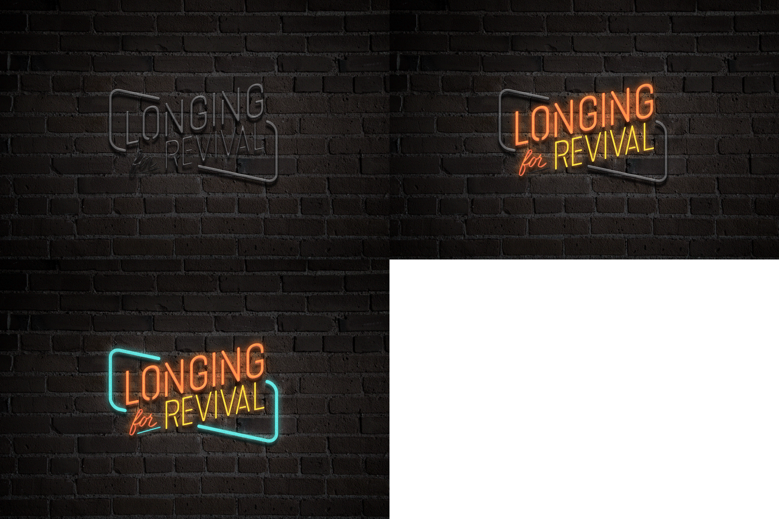
Neon - Initial Concept & Research
-

An alternative to the cliché
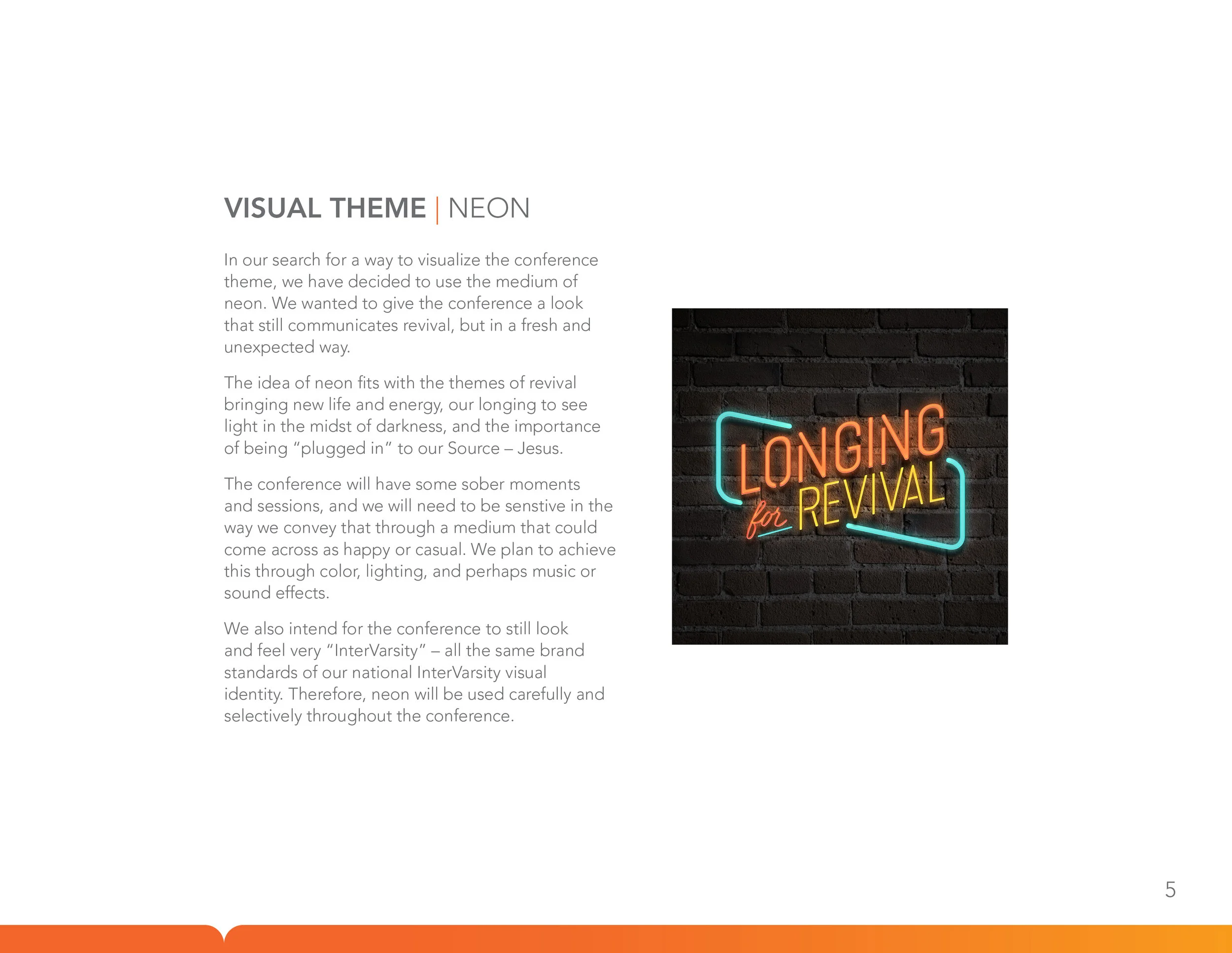
As the team explored concepts surrounding revival, we initially looked at a lot of imagery that related to light and fire. While both light and fire in themselves seem a bit more cliché, we came across the idea of neon lights, which felt like it could still serve as a symbol for new life and energy, while also being somewhat unexpected and new.
-

Further connections with theme
The directors used the term “Close to the Source” which means abiding, being “plugged in” to Jesus. Neon by nature needs to be plugged into be working.
Neon signs can sometimes be associated with places like bars or clubs, which connects to longing for revival in unexpected, unlikely places.
Neon also has a retro vibe which could refer to themes of renewal, restoration, rebirth, or reawakening.
-

Design flexibility and potential
The monoline style and bright colors in neon are cohesive with the InterVarsity brand. This style also lends itself well to animation potential (see above).
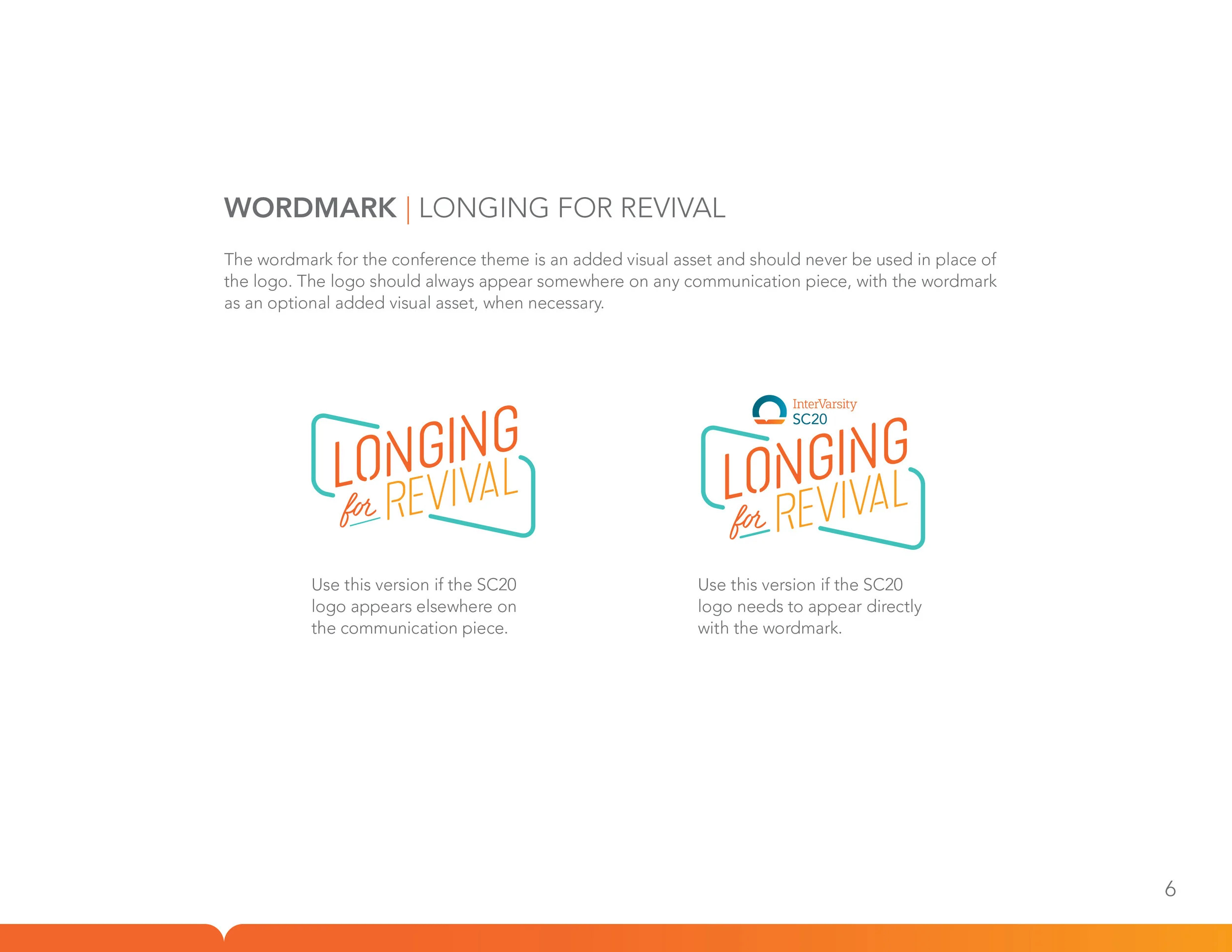
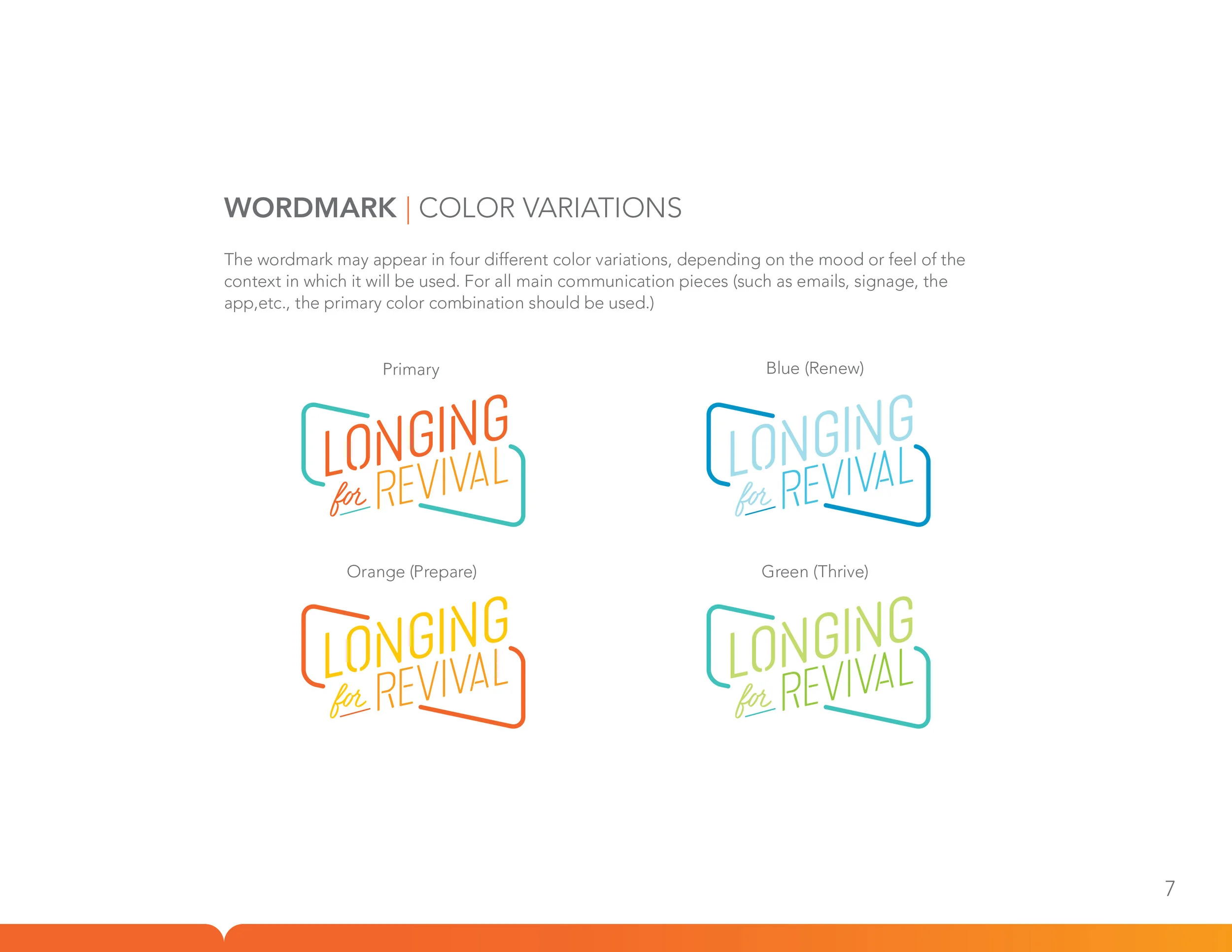
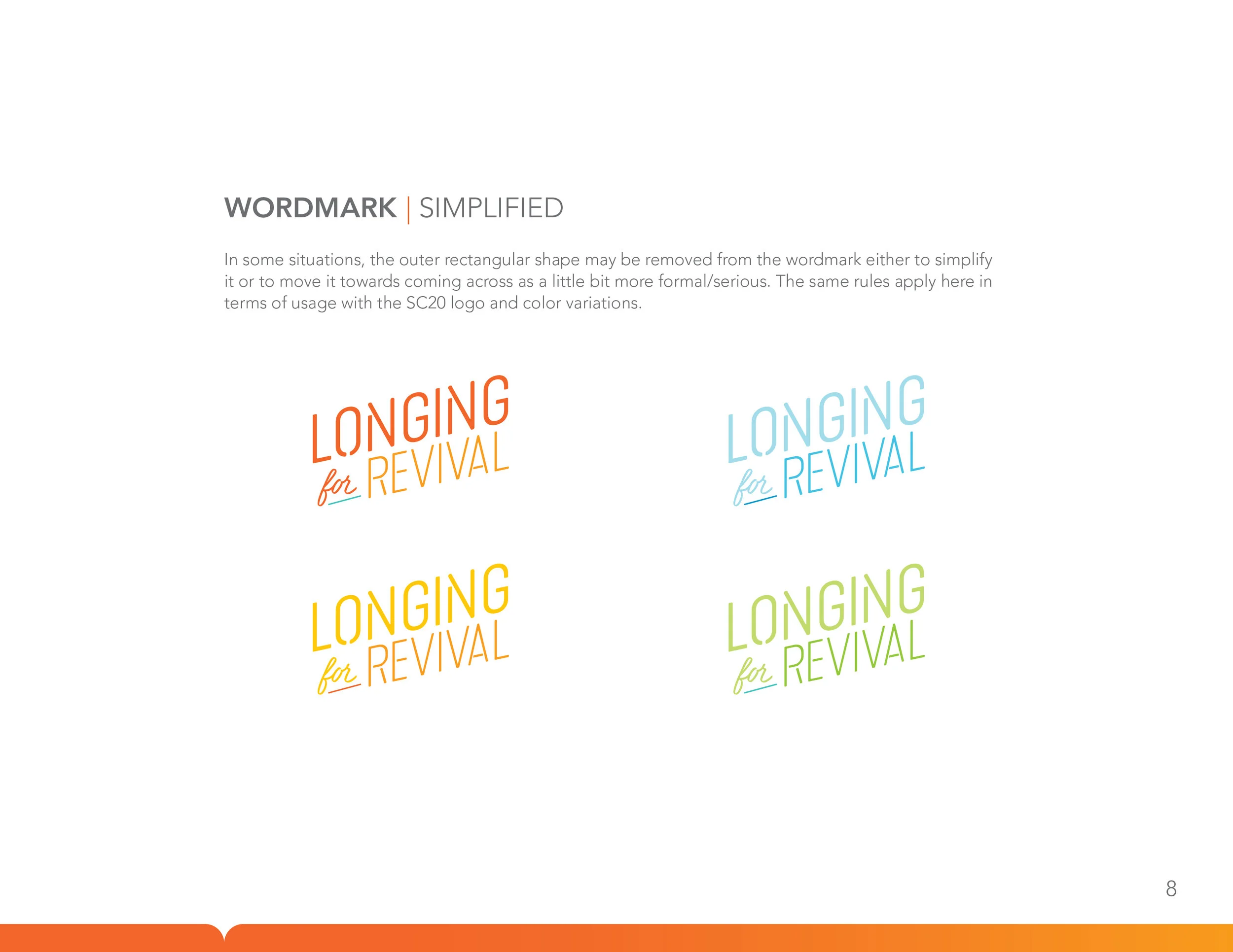
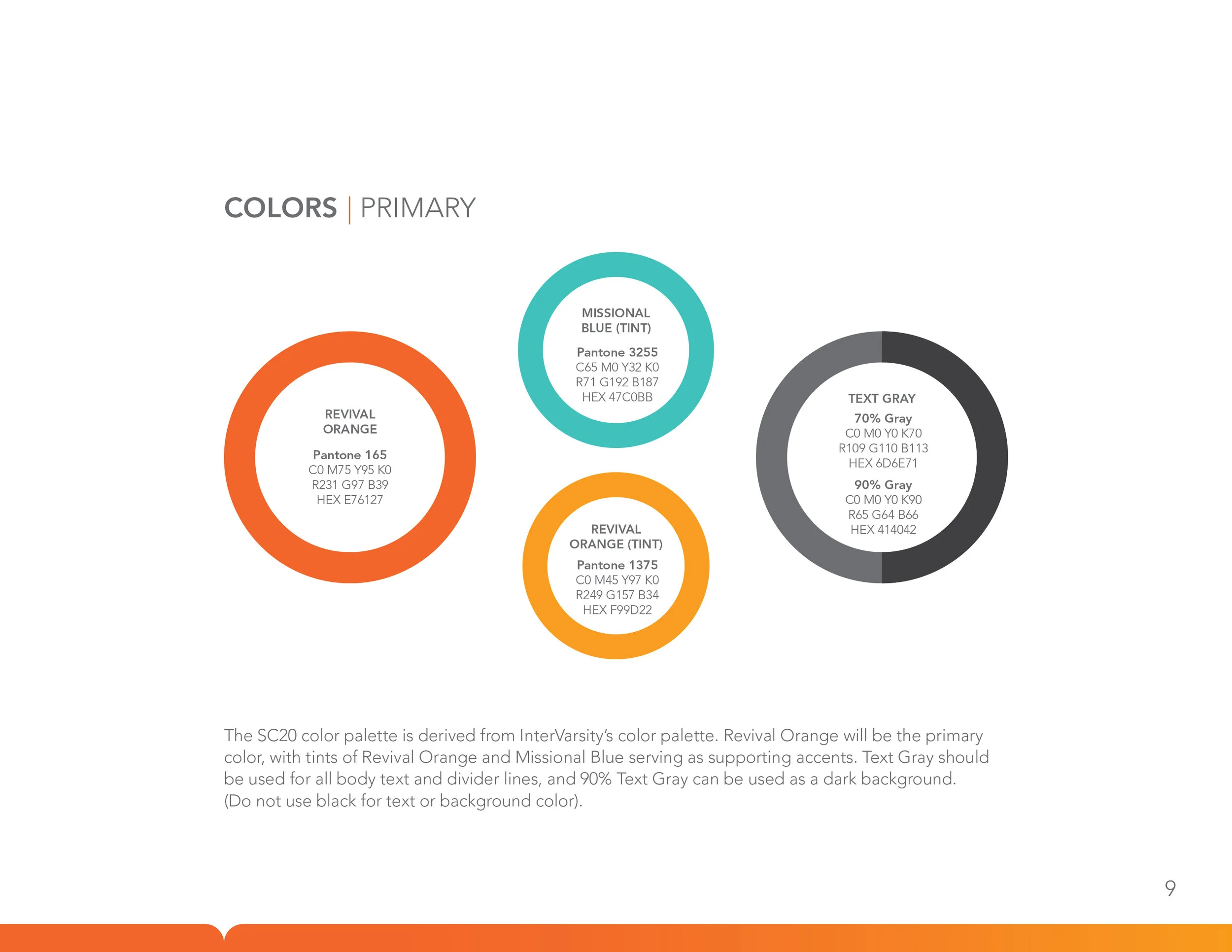
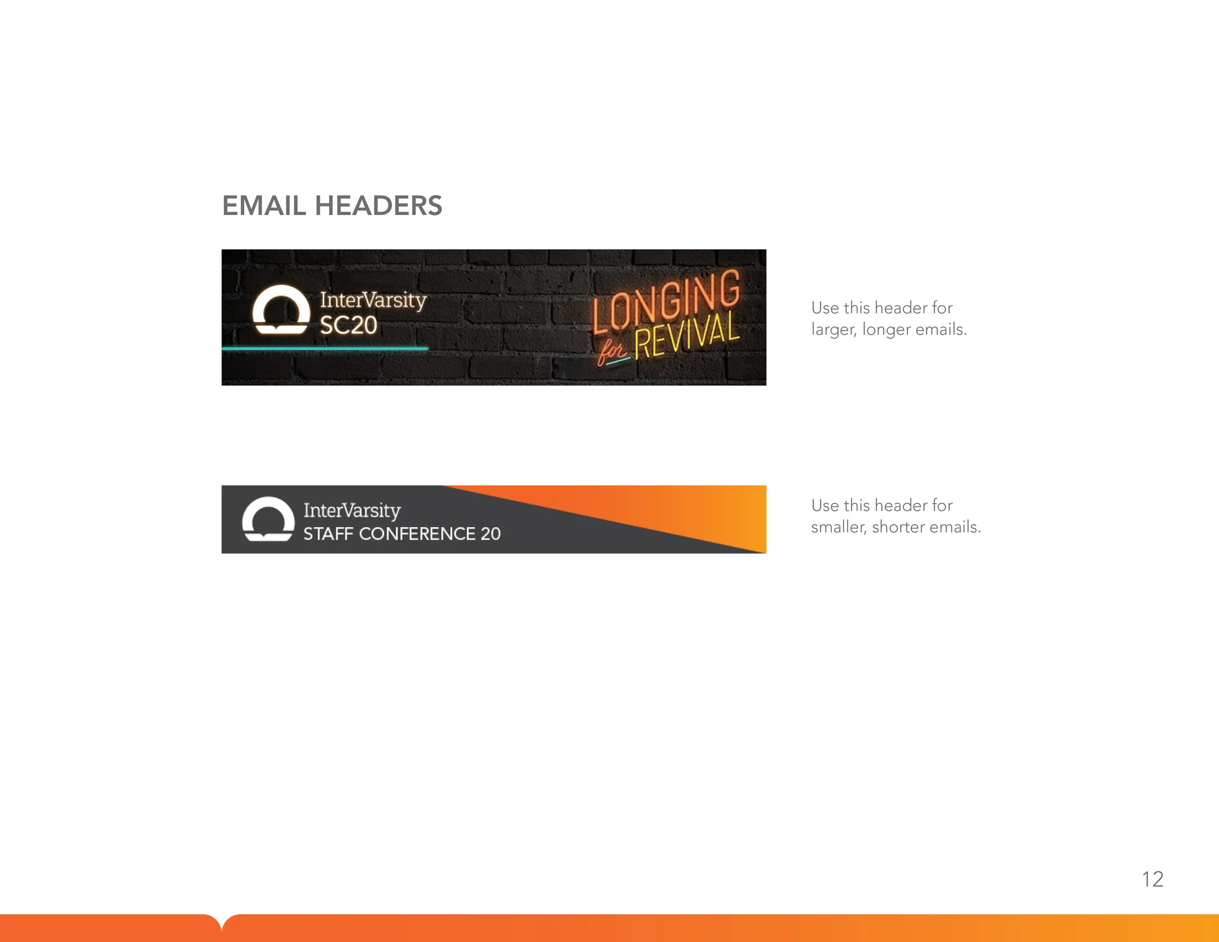
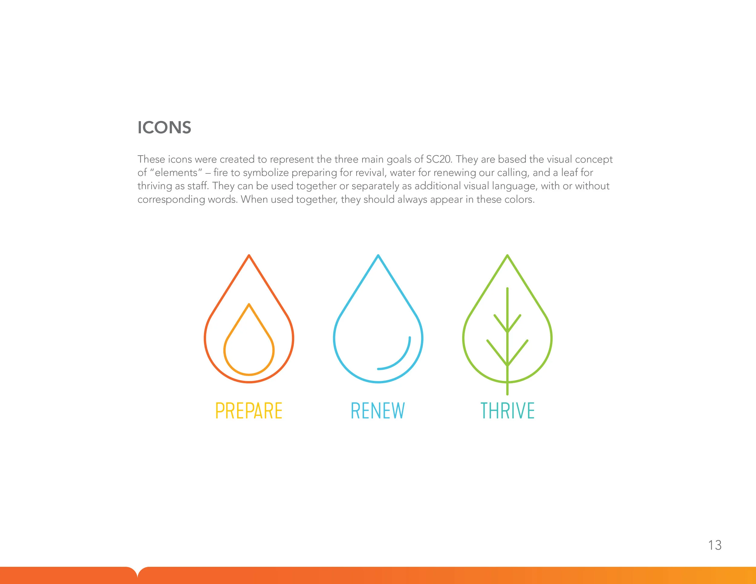
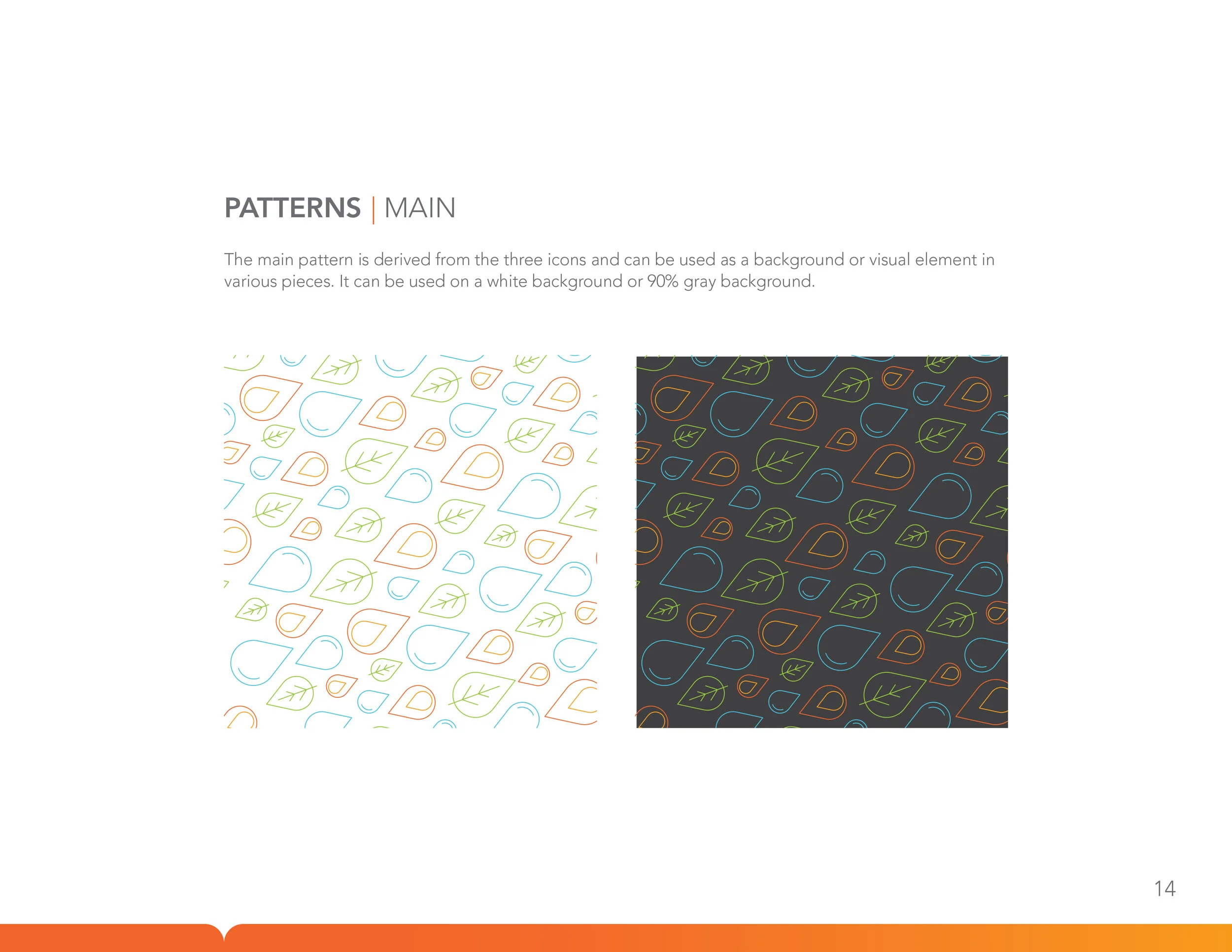
Style Guide
Onsite
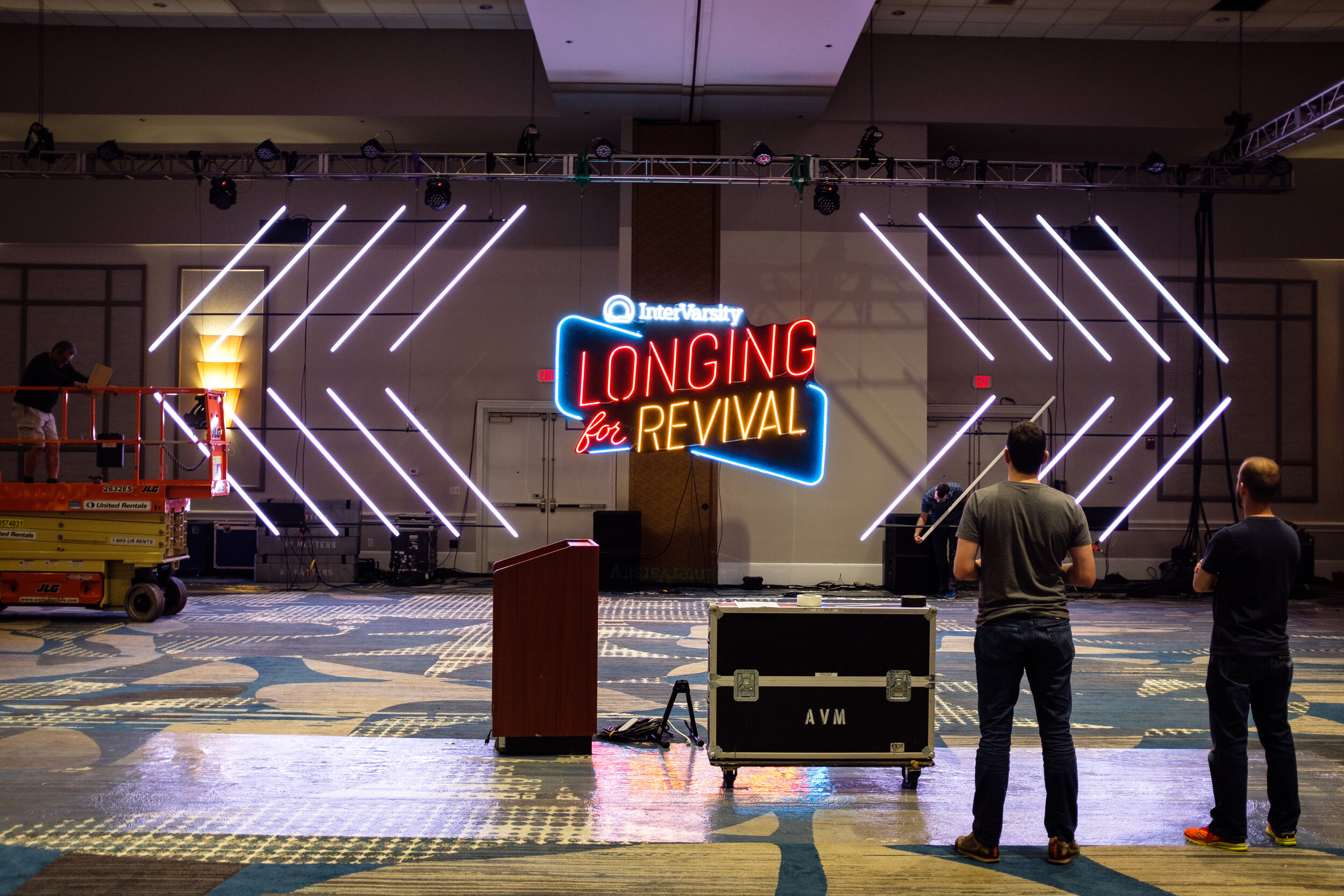
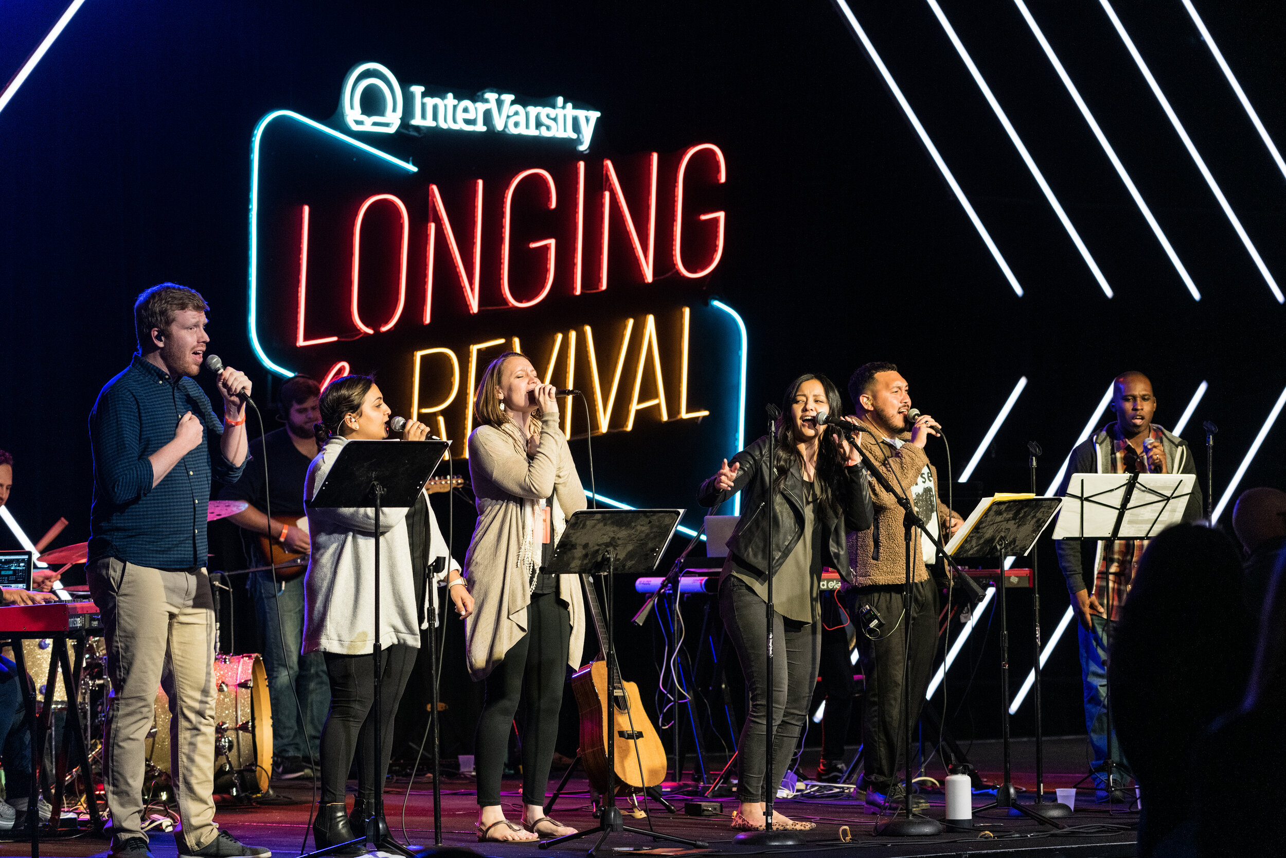
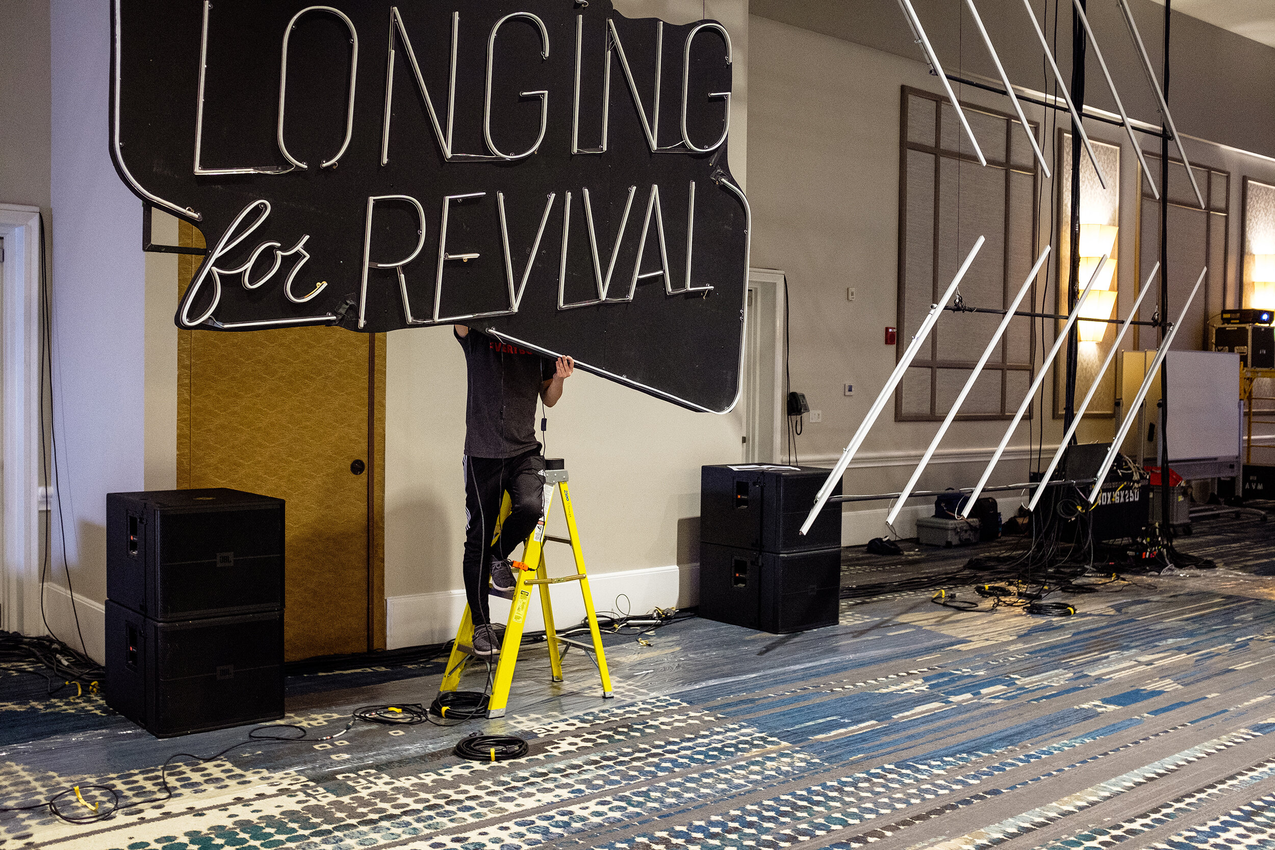
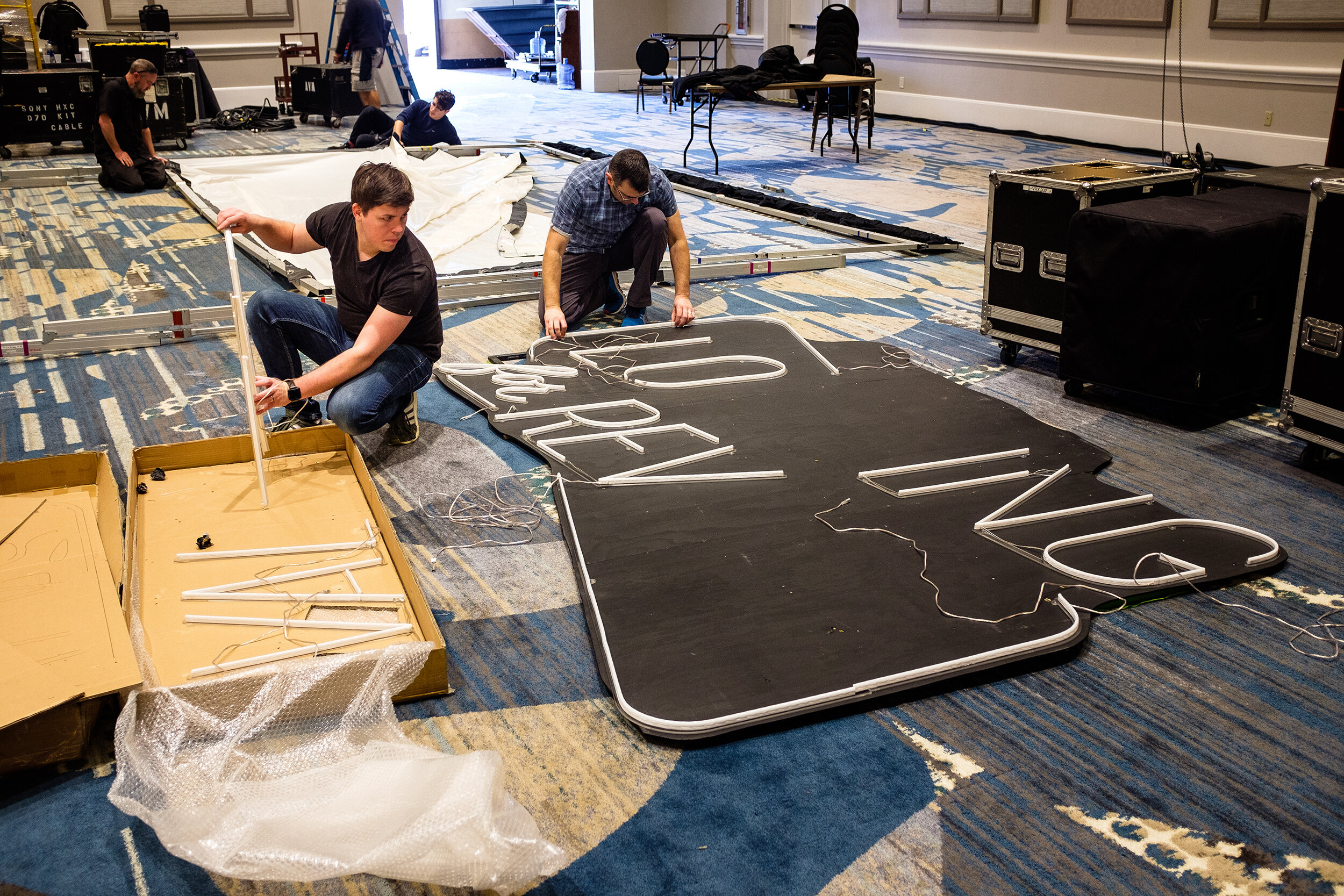
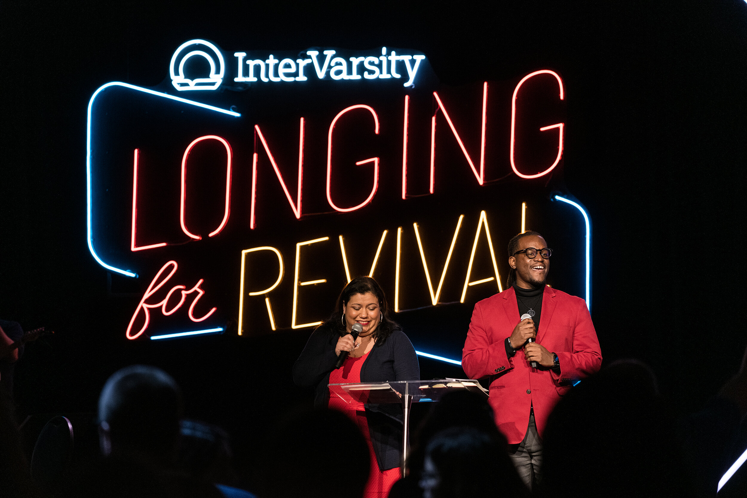
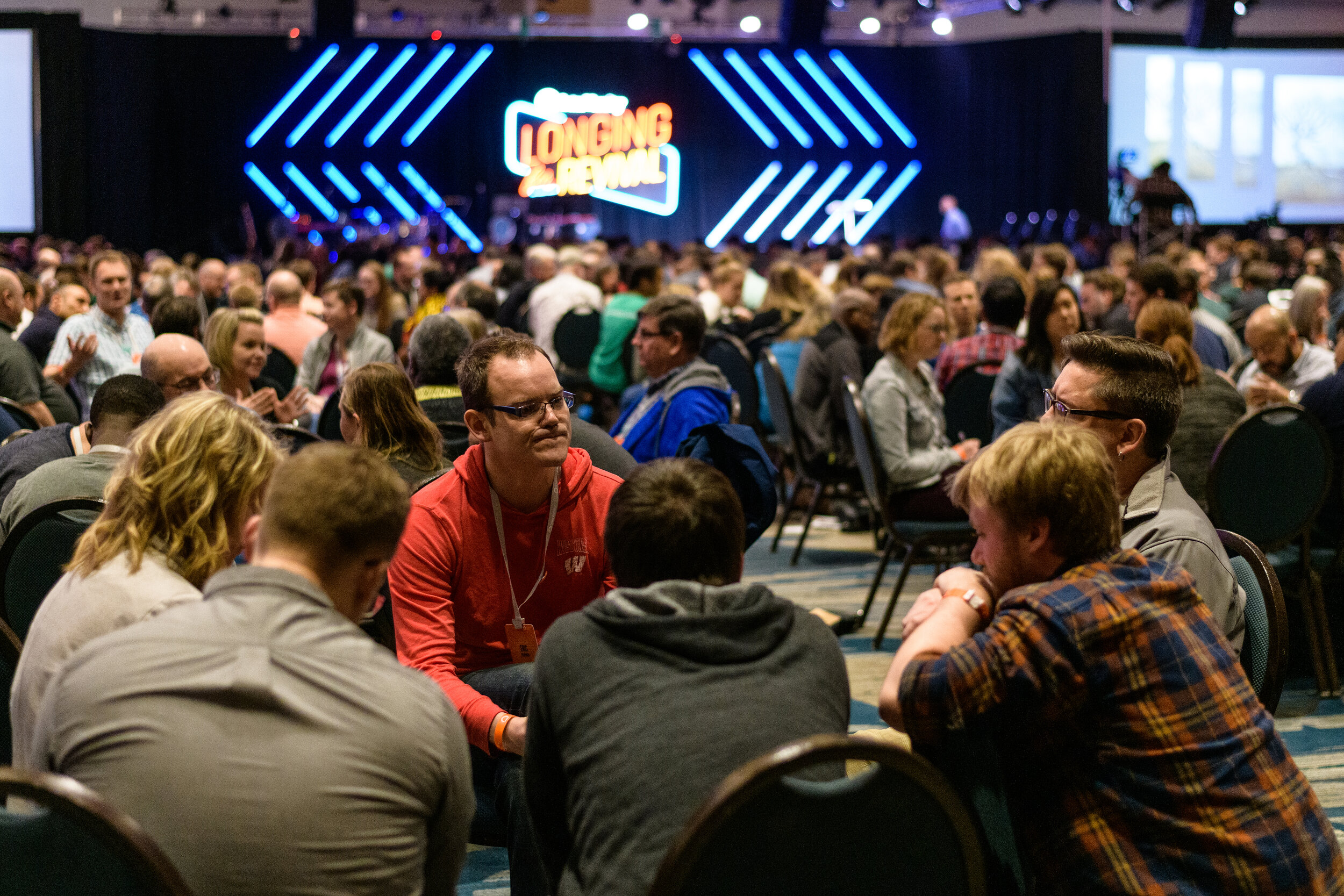
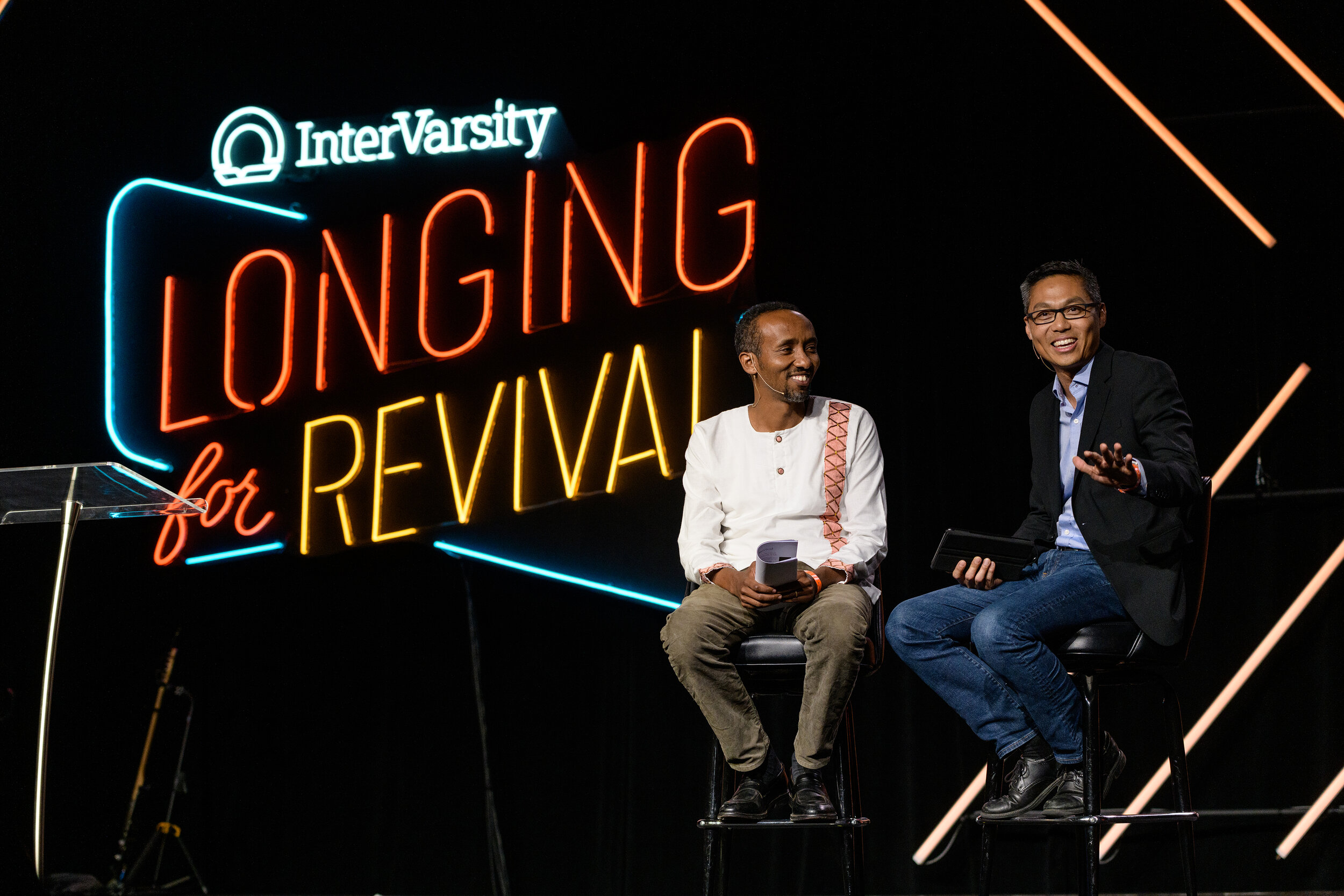
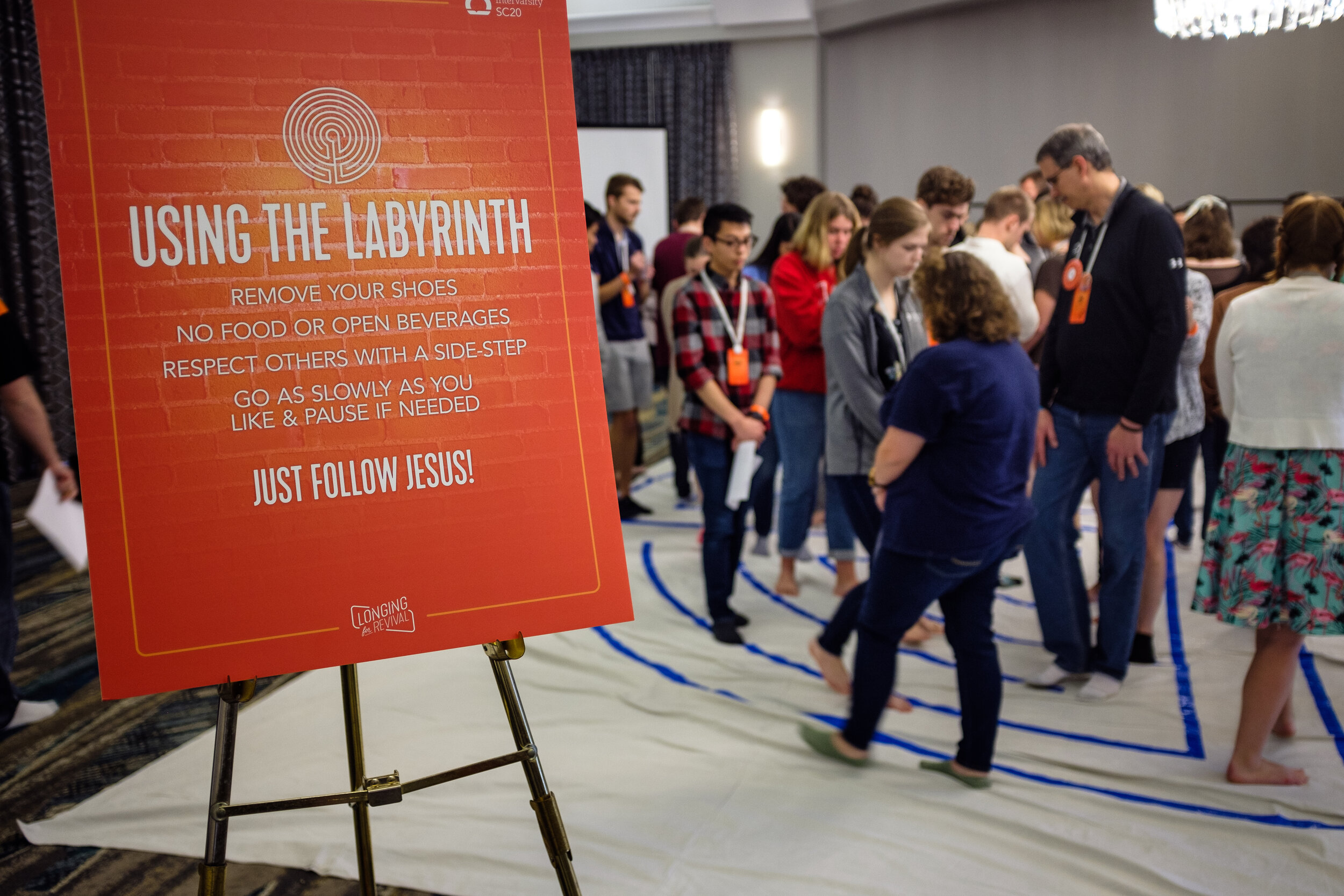
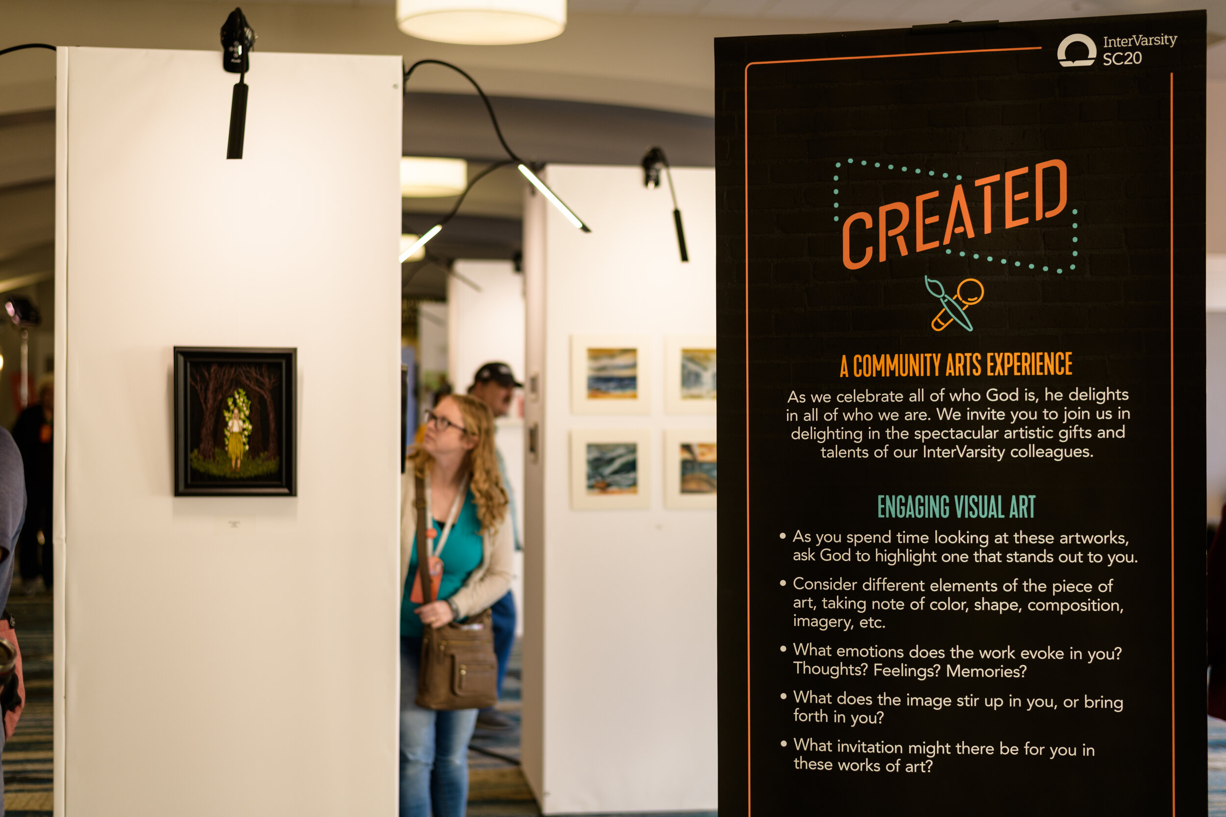
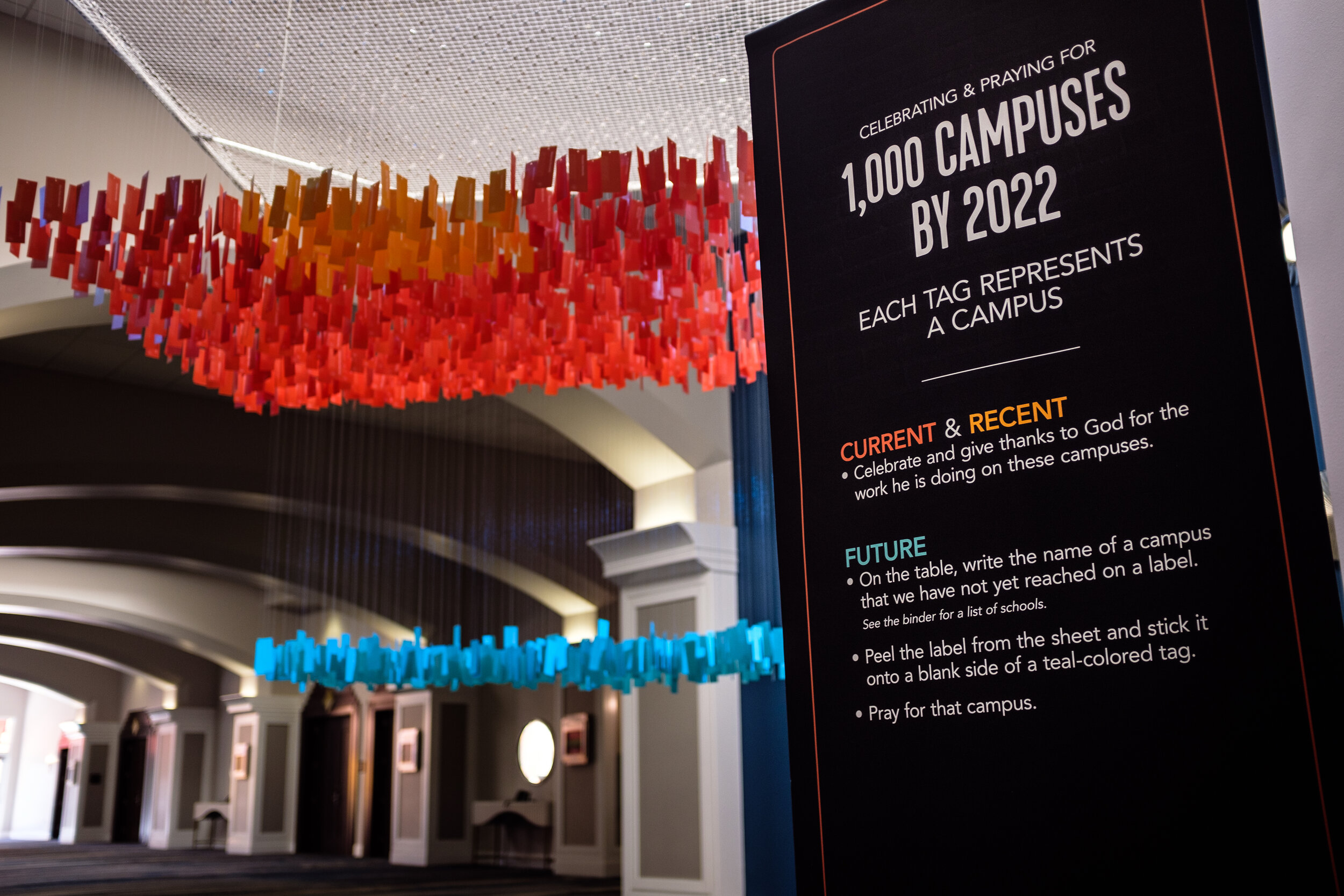
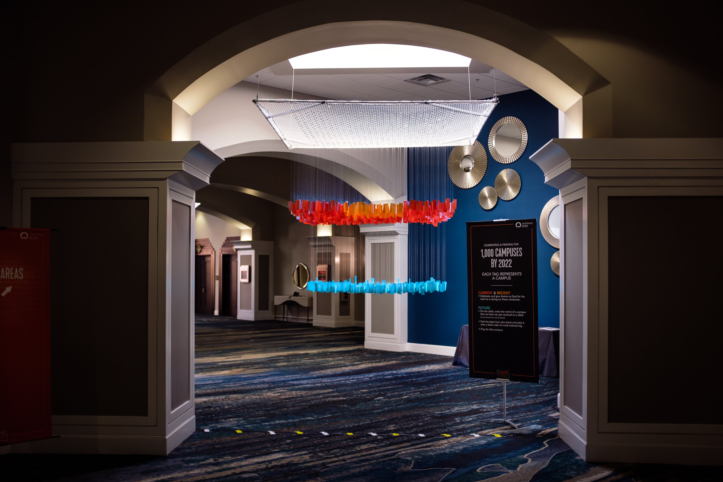
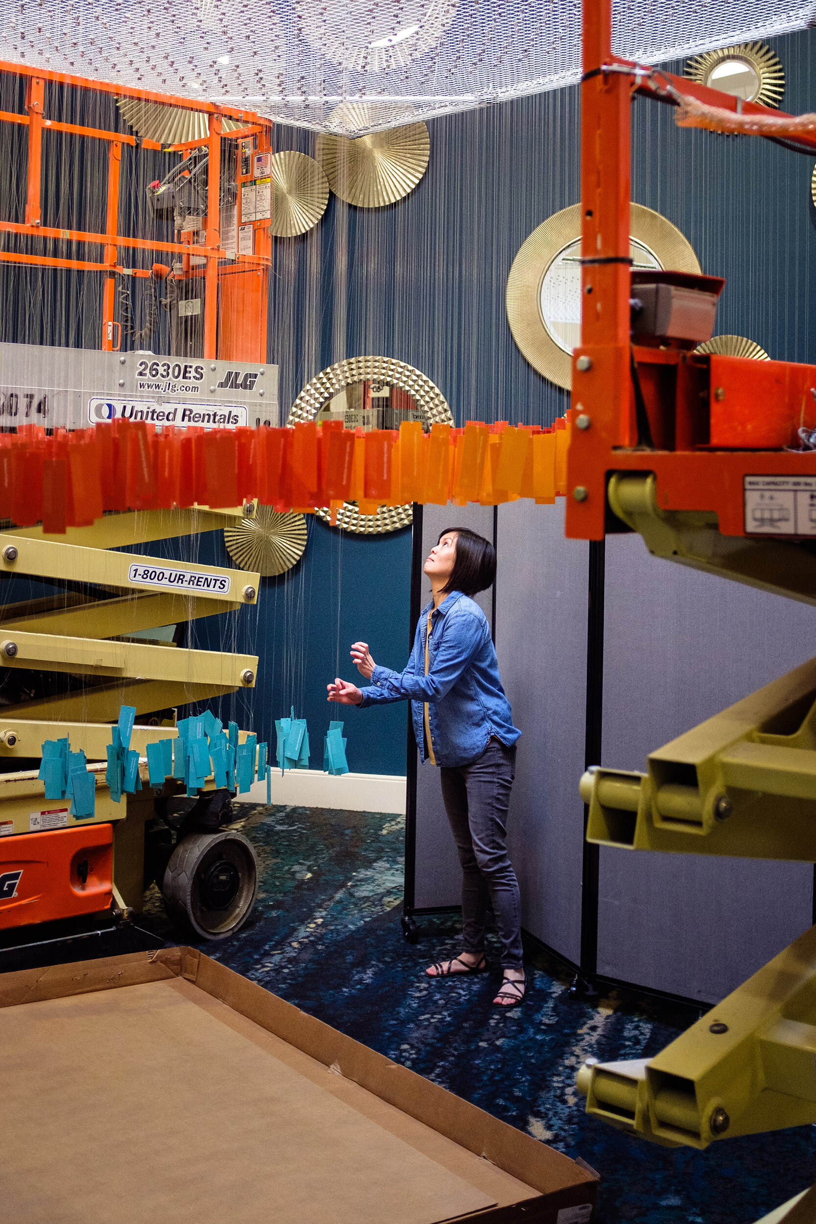
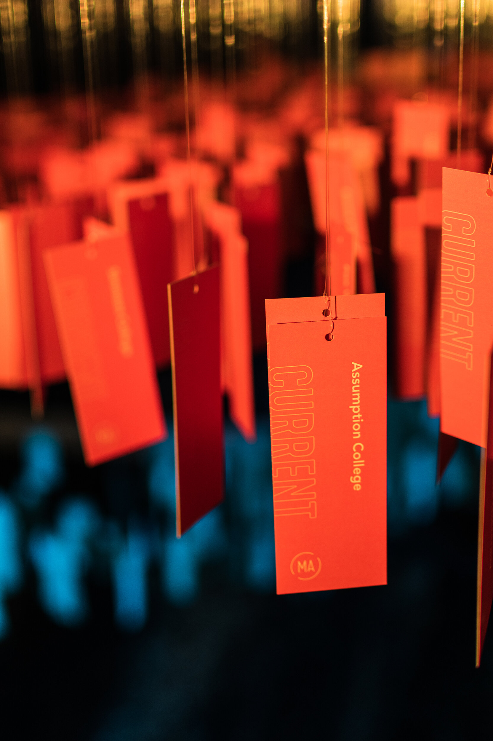
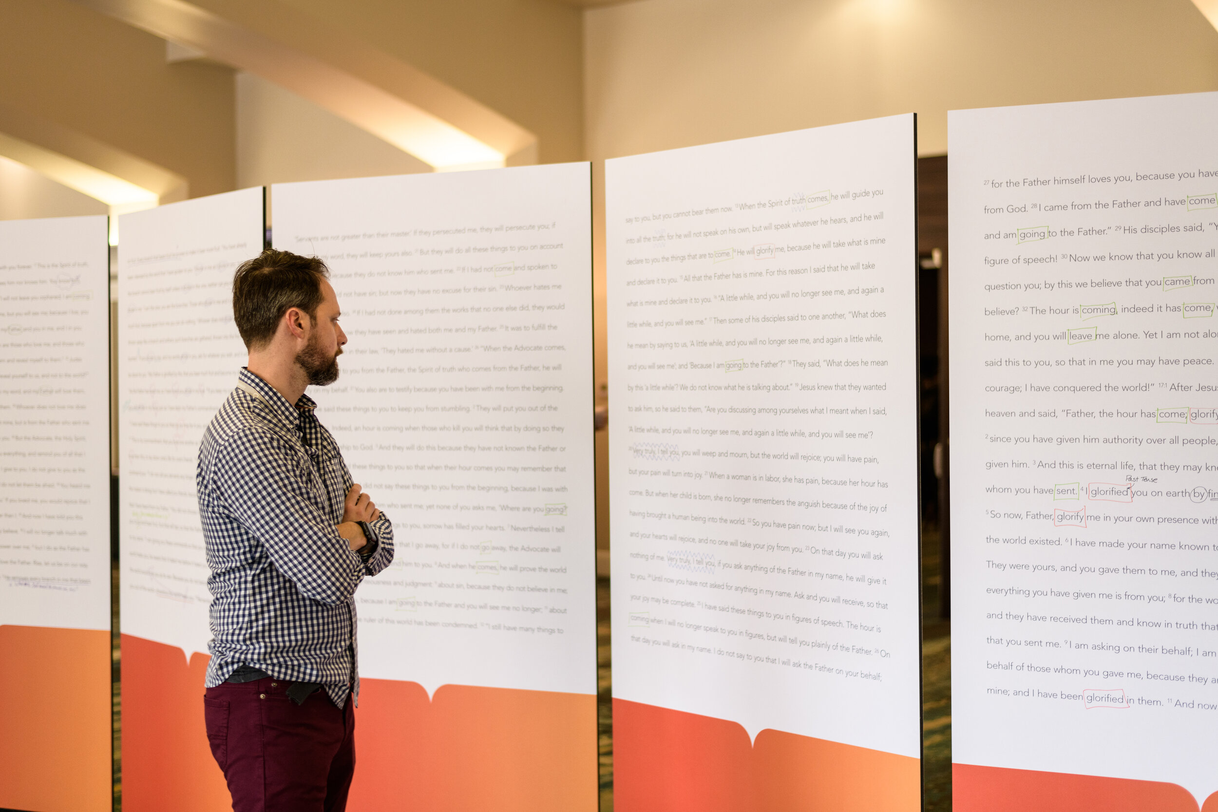
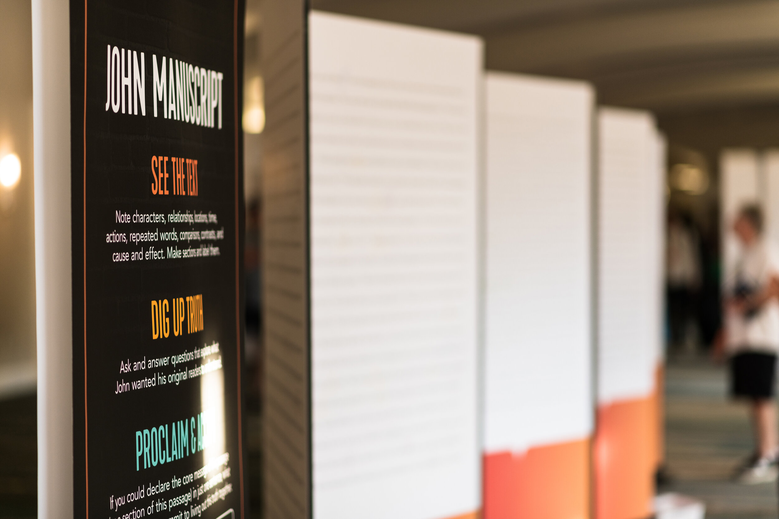
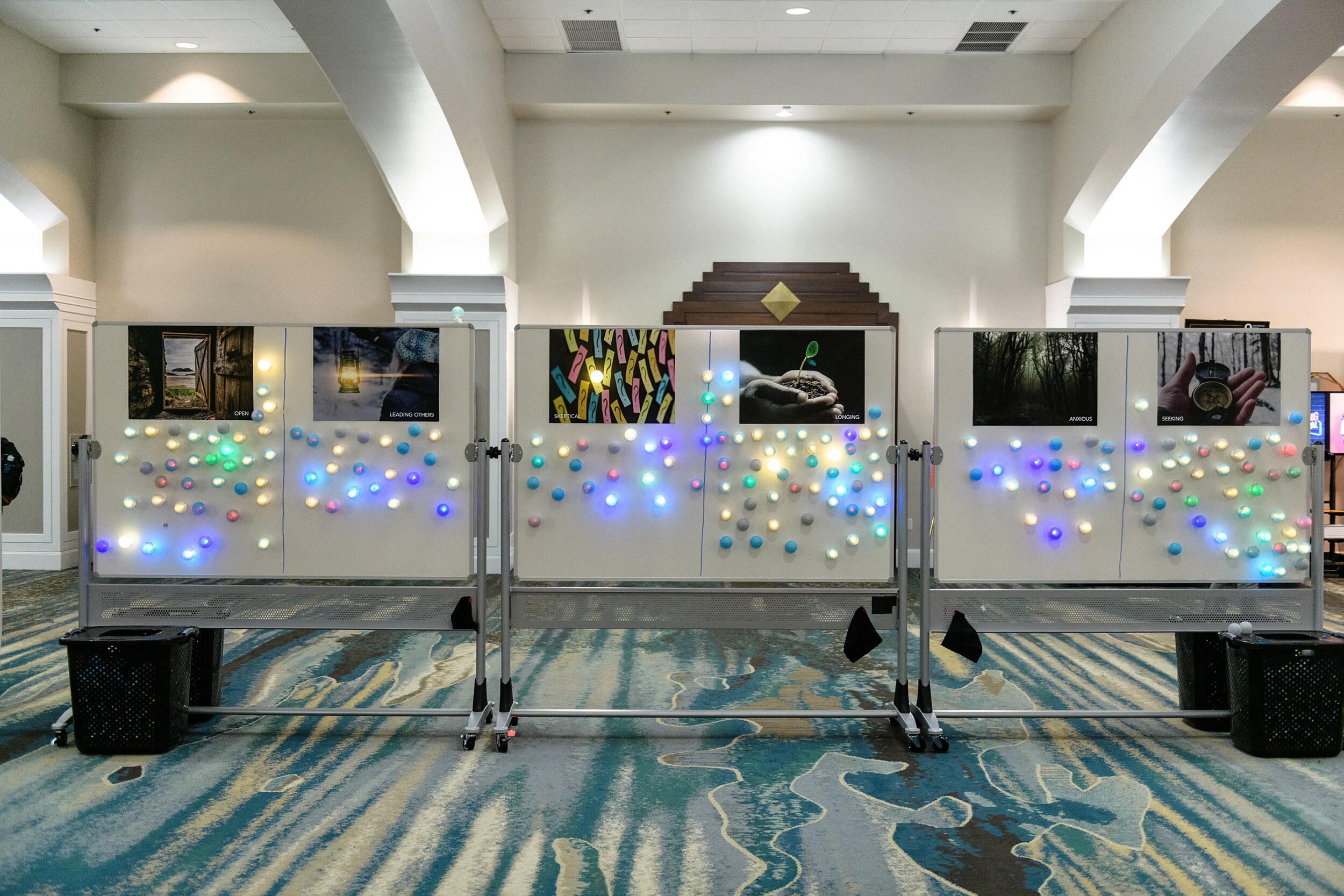
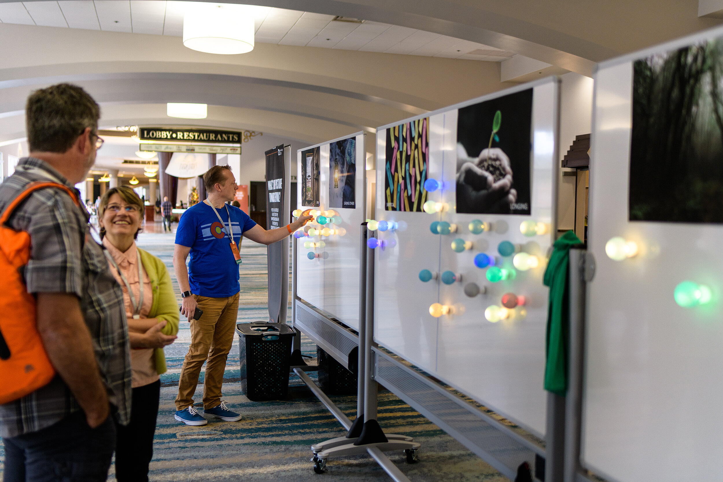
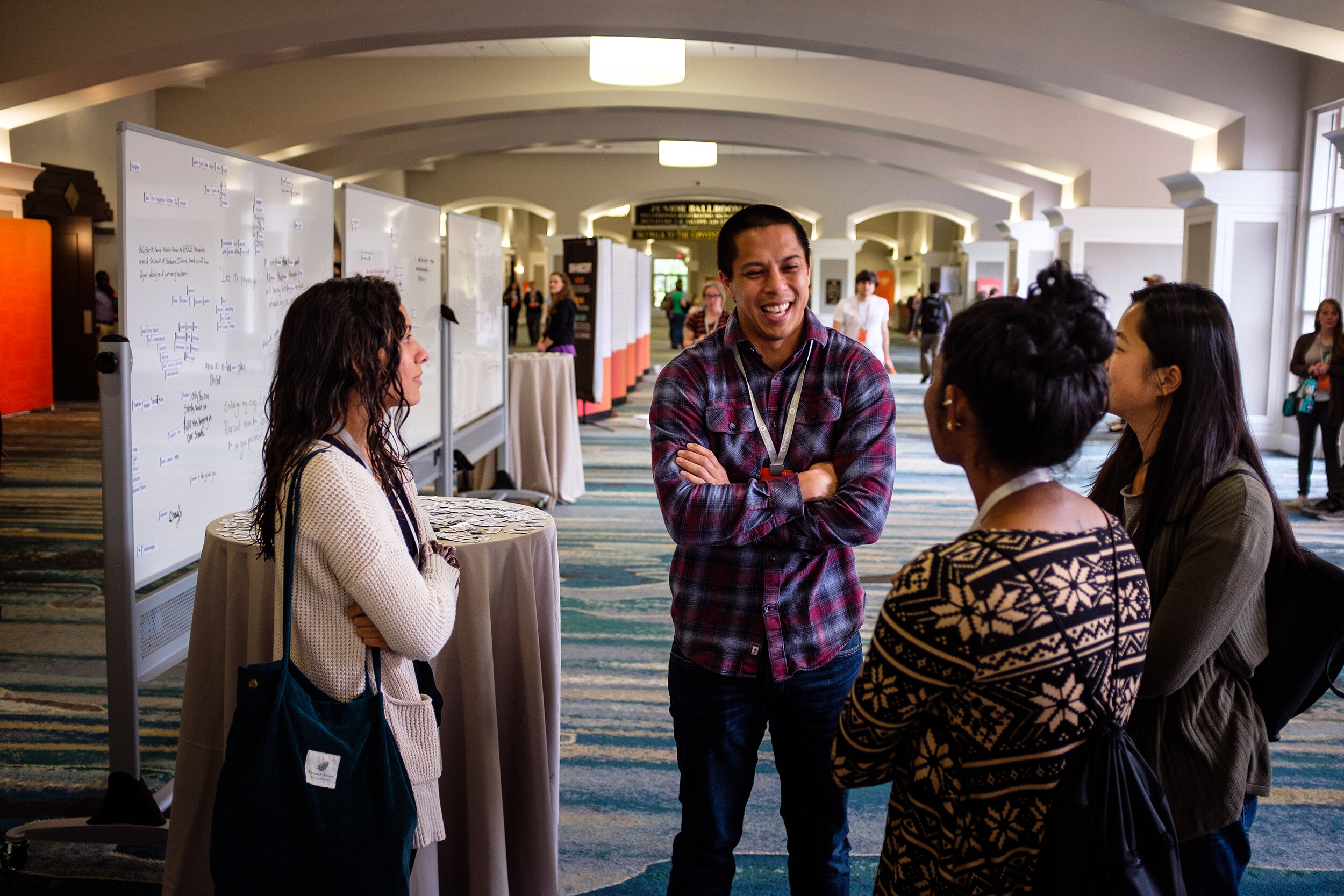
Our neon concept translated into a variety of pieces for the conference. The centerpiece being a 12 foot wide neon sign that was create for the stage backdrop. We also had signage, interactive displays in the hallways, and an art piece that displayed 1,000 campuses that we have reached and aspire to reach by the year 2022.
Photography: Matt Kirk



Prayer Cards
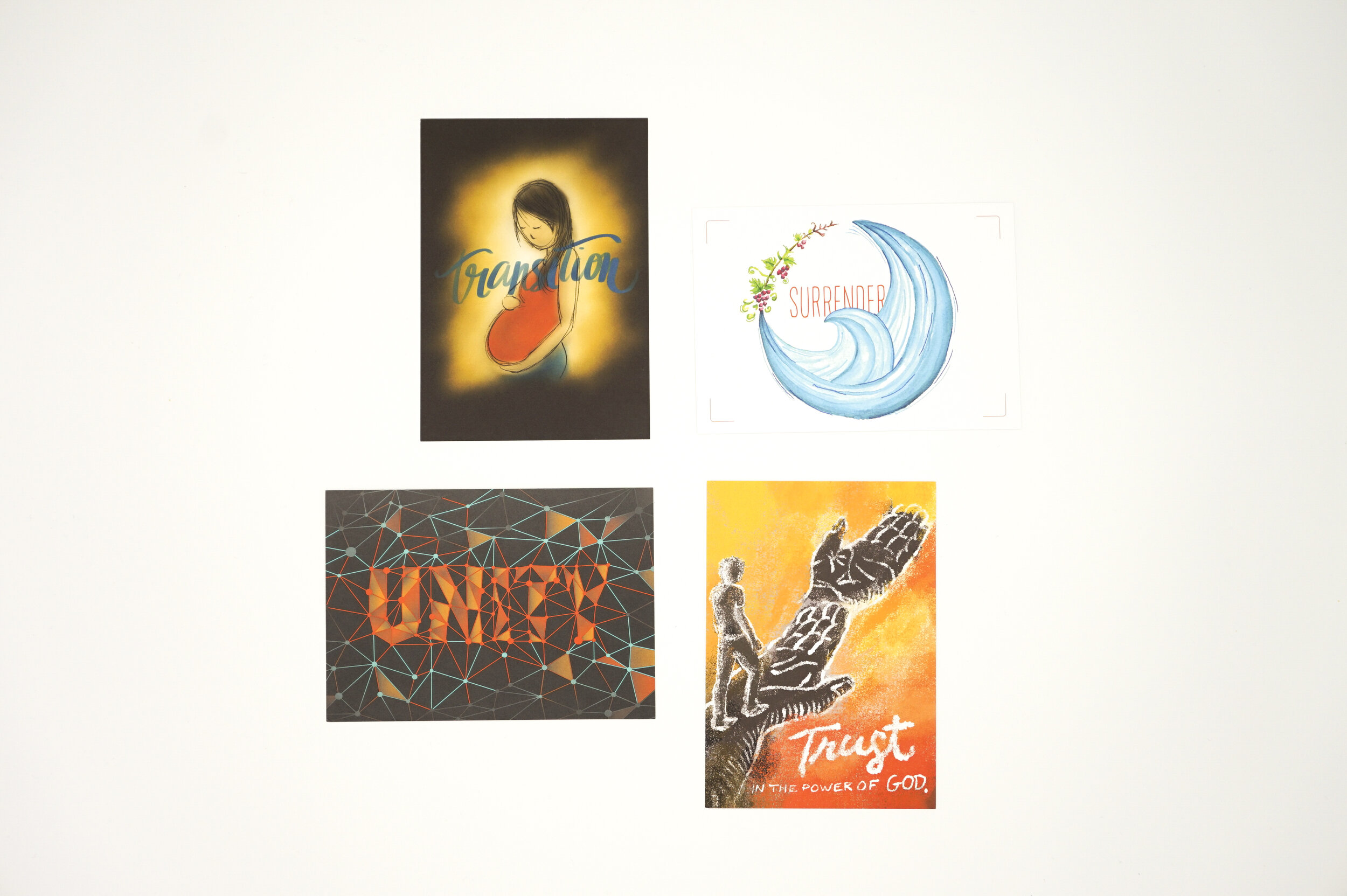
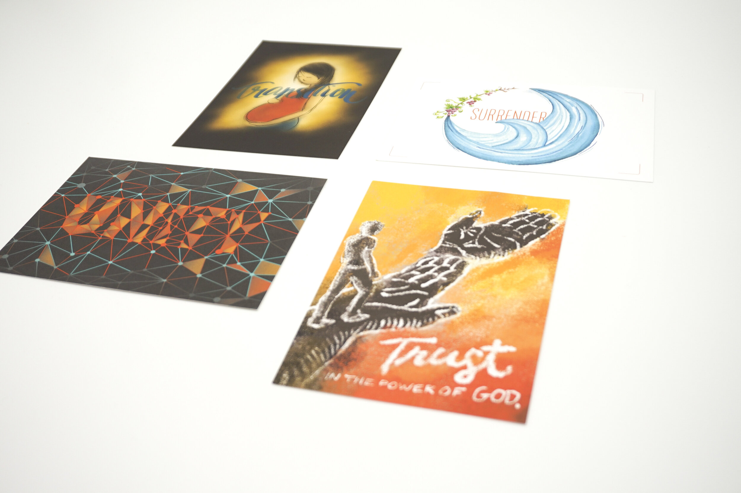
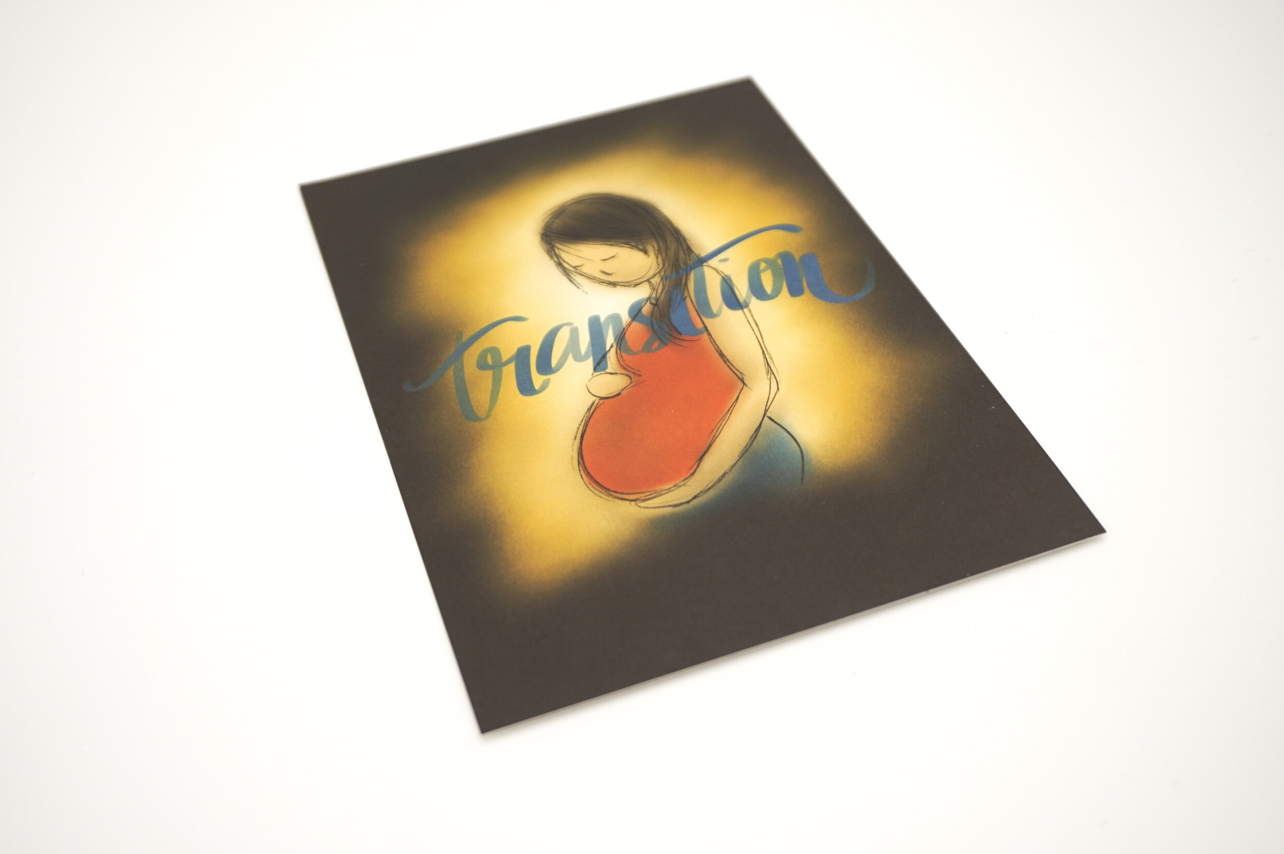
After the conference, our Design Team created these prayer cards as a response to the themes that emerged from the prayer session. We spent time in listening prayer together to receive images and ideas that would visualize these themes. Then we each created one card using various media, tying them together with a similar color scheme. The cards were mailed to all 1600 staff as a keepsake from the conference.
Transition: Laura Li-Barbour, Surrender: Courtney Herwicz, Unity: Paul Lee, Trust: Gary Nauman
