As Art Director, I led an organizational rebrand for InterVarsity Christian Fellowship in 2018.
InterVarsity is a nationwide campus ministry with over 900 chapters. The last time a new visual identity had been created was in 1999. The old look and feel was corporate and did not work well for the ever-changing context of social media and digital platforms. Over the course of about 18 months, our team developed a completely new brand identity and launched it in the fall of 2018, at the start of InterVarsity’s “2030 Calling”, a 12-year campaign to reach 2,500 campuses by the year 2030.
Design Team: Courtney Herwicz, Gary Nauman, Paul Lee, & Jonathan Gay
Photography: Matt Kirk, Paul Lee, Jonathan Gay
Video Production: Matt Kirk, Steven Vanderworp, Matt Bauer-Yuen
Art Director: Laura Li-Barbour
Creative Director: Dan Pinka
Vice President of Communications & Marketing: Adam Jeske
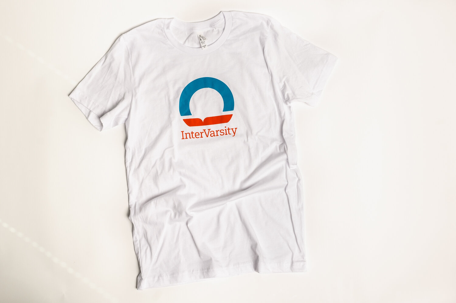
Our logo communicates the most important and distinctive characteristics of our brand: the foundation of Scripture in all we do, and our desire to bring light to the world through our ministry on campus. The shape is intentionally abstract and simple, to be filled up over time with positive associations through experiences with InterVarsity’s people, events, and books.
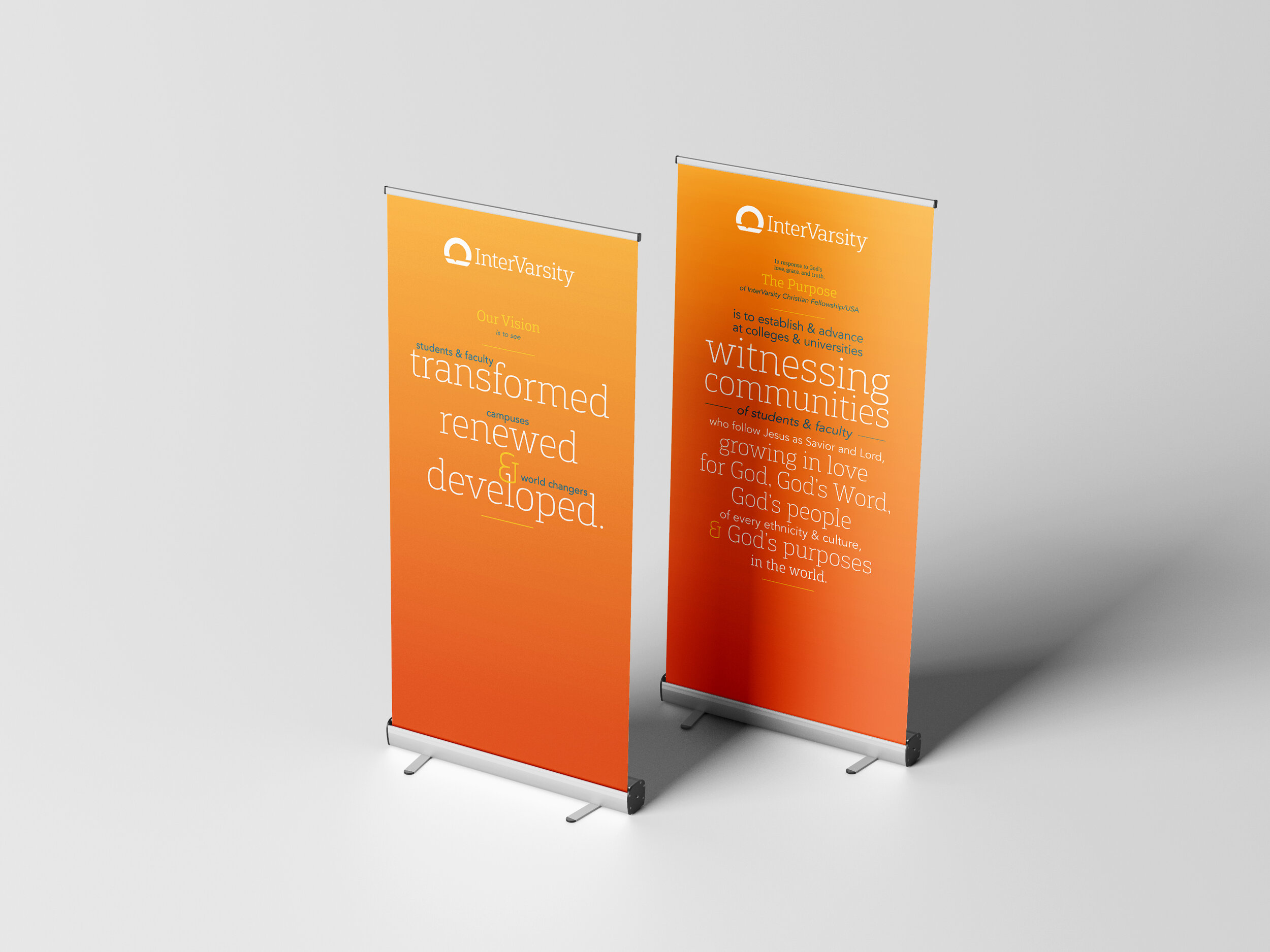
The slab serif font, Gaspo, has a collegiate appearance while also feeling light and contemporary. The wordmark is spelled with lower and uppercase letters because it gives our name a more approachable, friendly, and modern feel, and so we all know the V is capitalized!
With over 1500 staff across the country, we had to find ways to encourage them to implement our new brand elements. We had this Brand at a Glance poster printed and shipped to all our staff to serve as quick reference, rather than having to download or look up the larger Brand Book every time they needed it. We also included other fun swag such as stickers and colored pencils in the package.
For the new color palette, we decided to give each color a name that represents different aspects of our brand, both to reinforce our brand values but also to make the colors more memorable and fun.

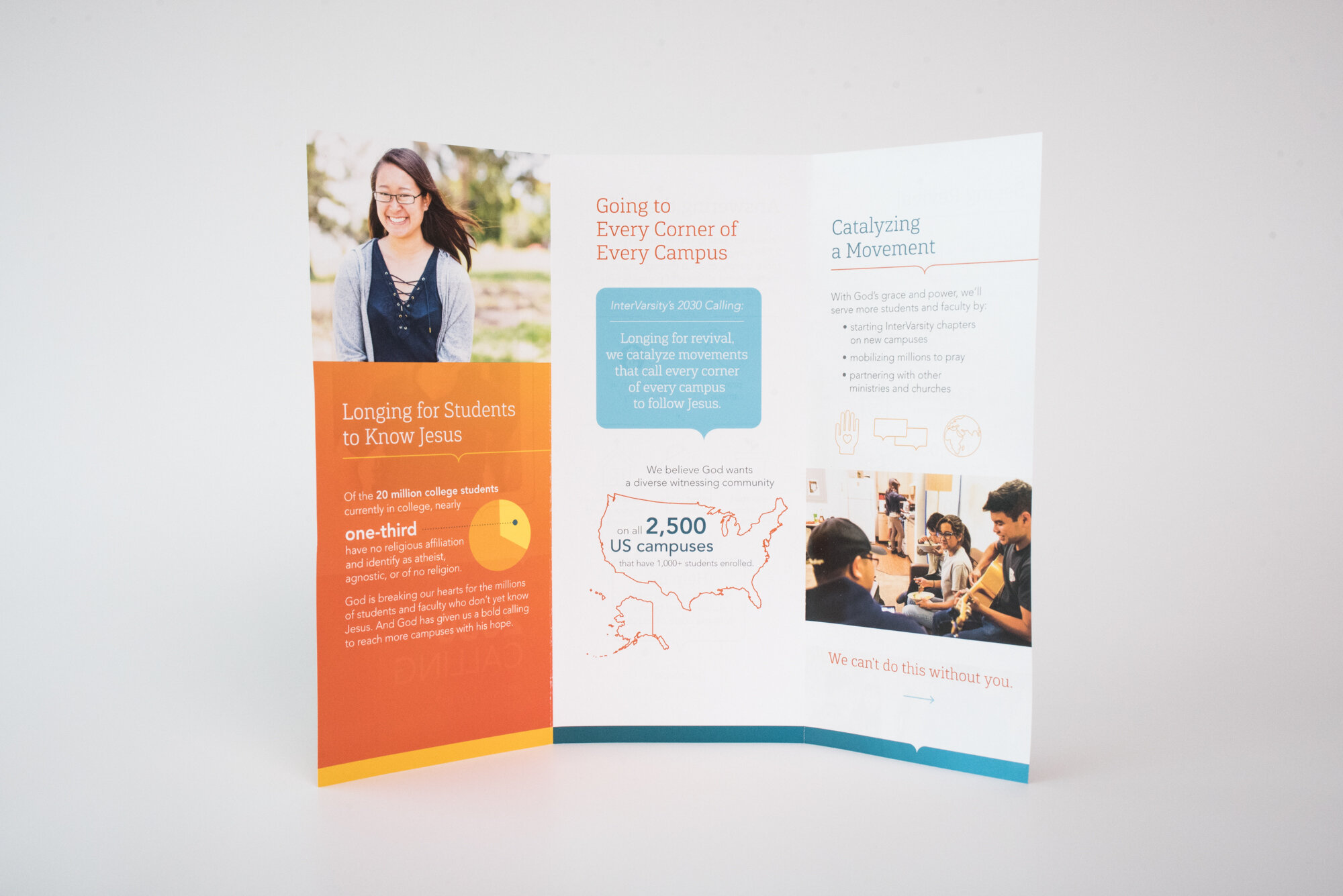
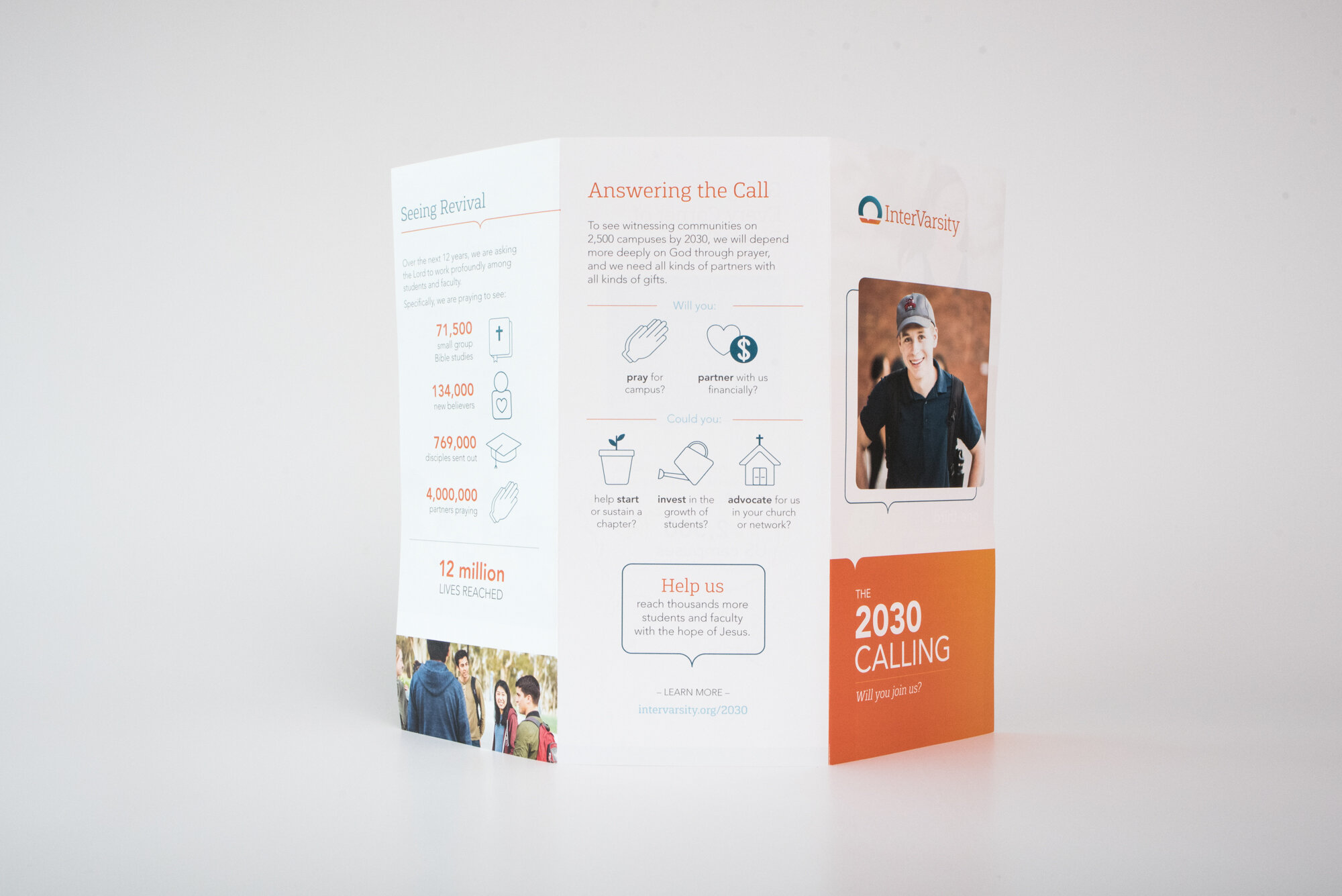

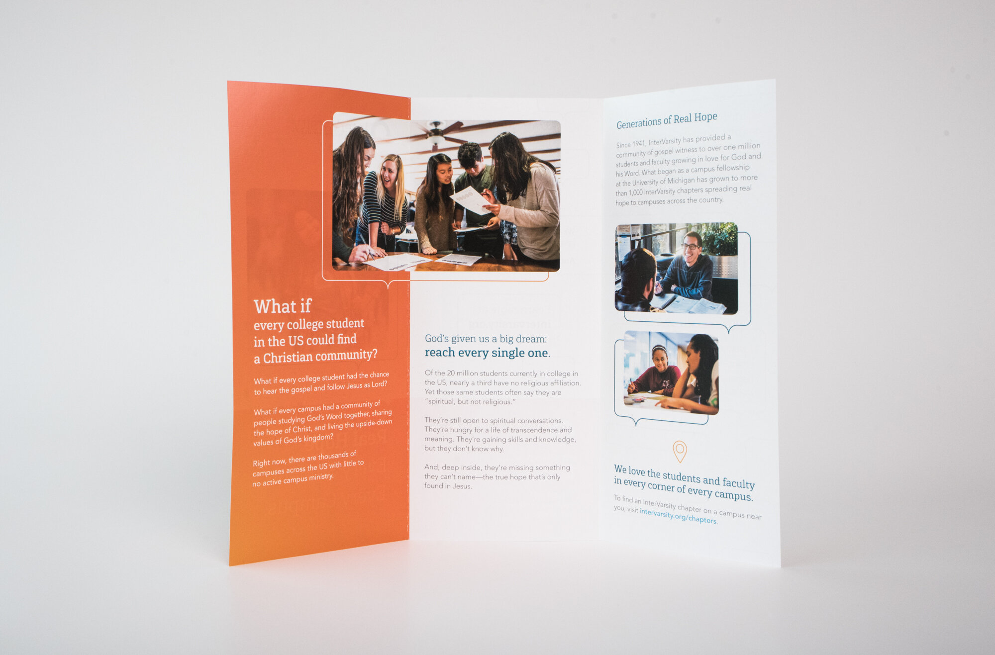

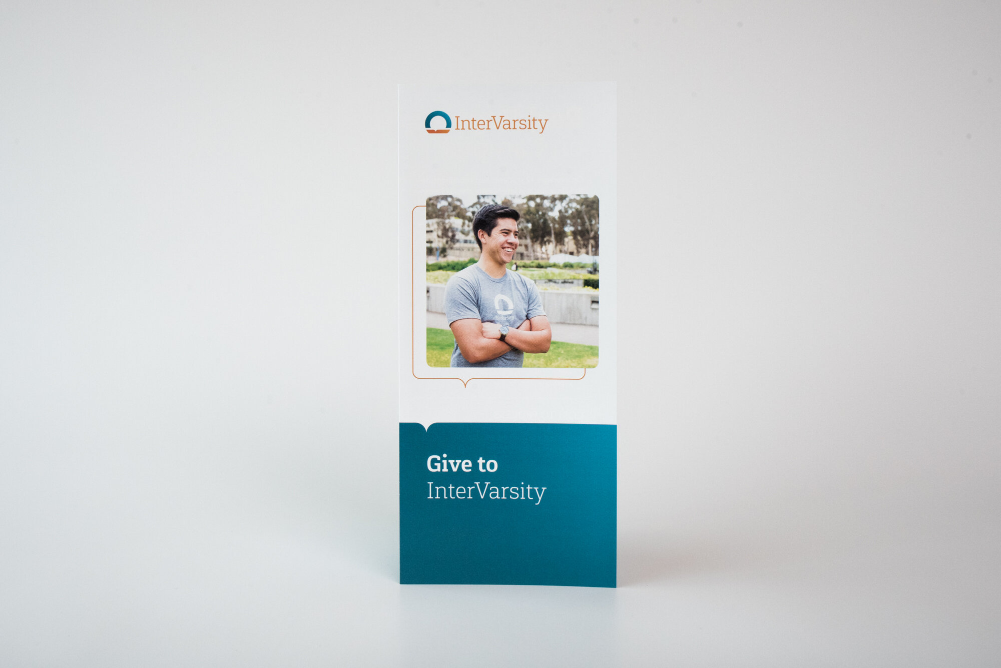

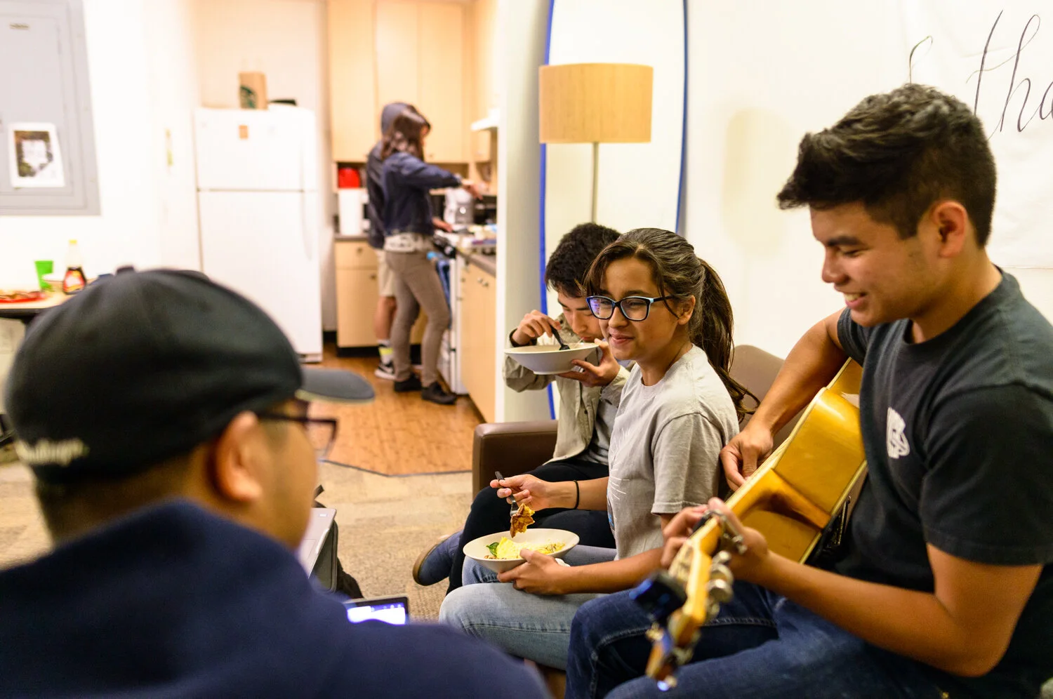
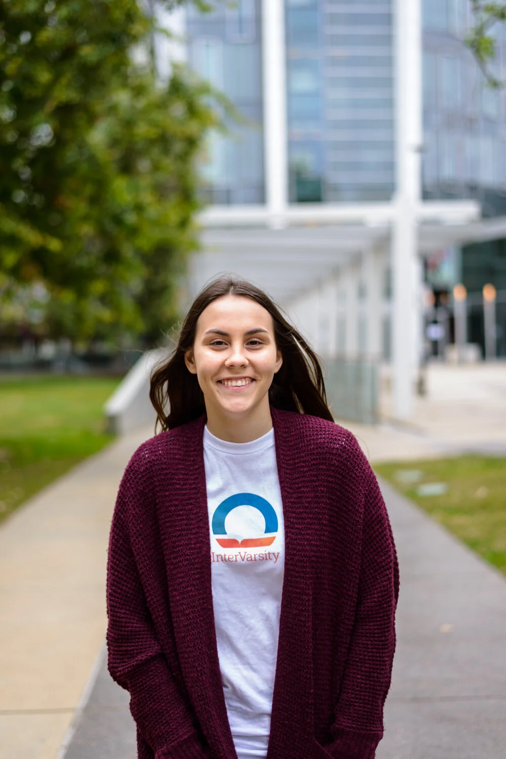
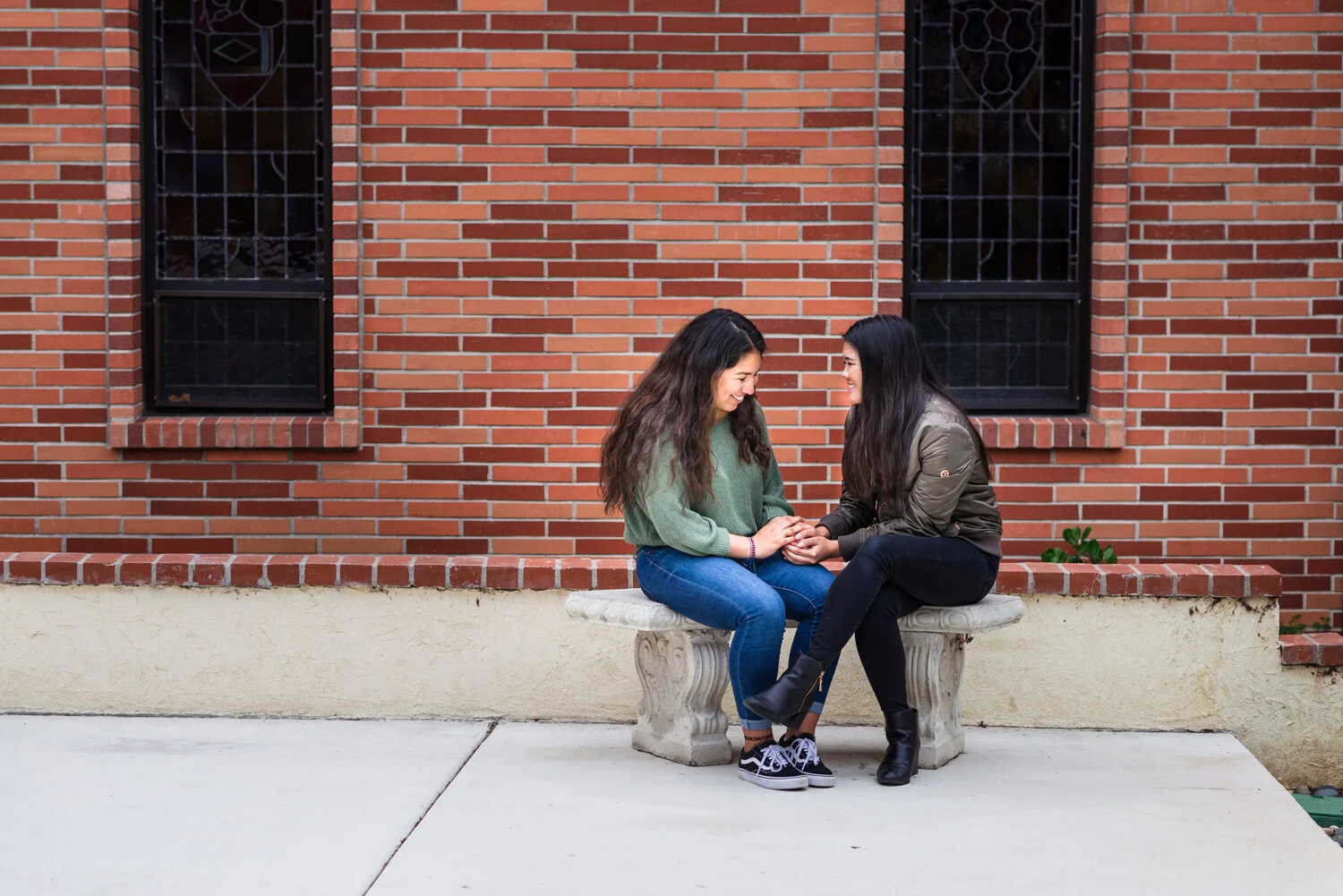
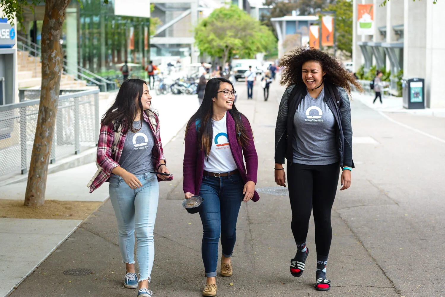
Students are at the heart of our brand.
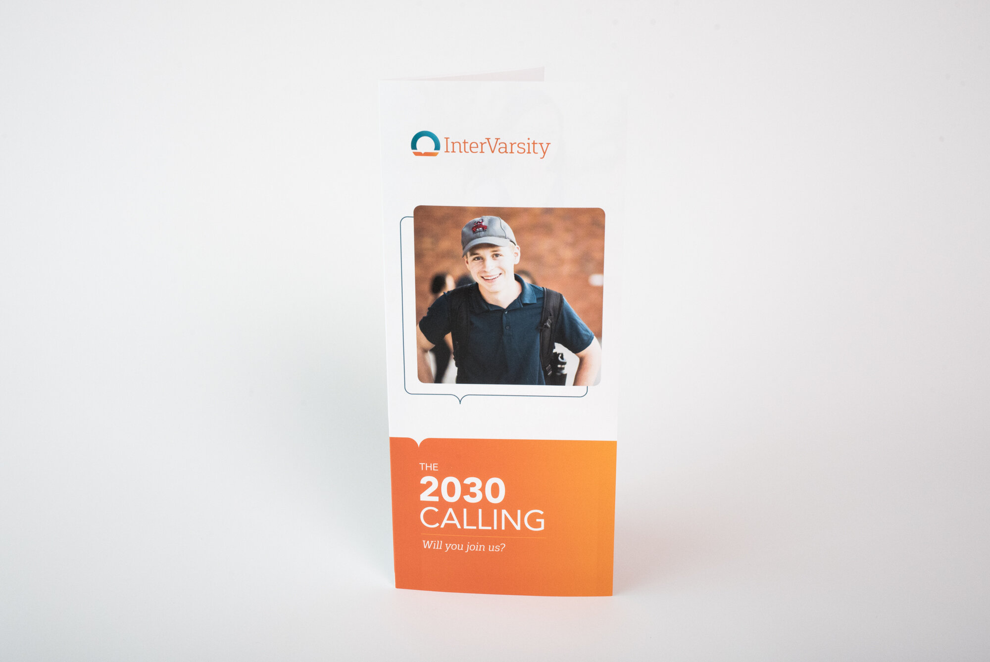
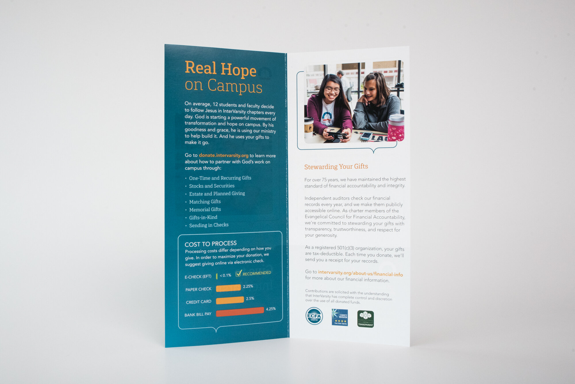
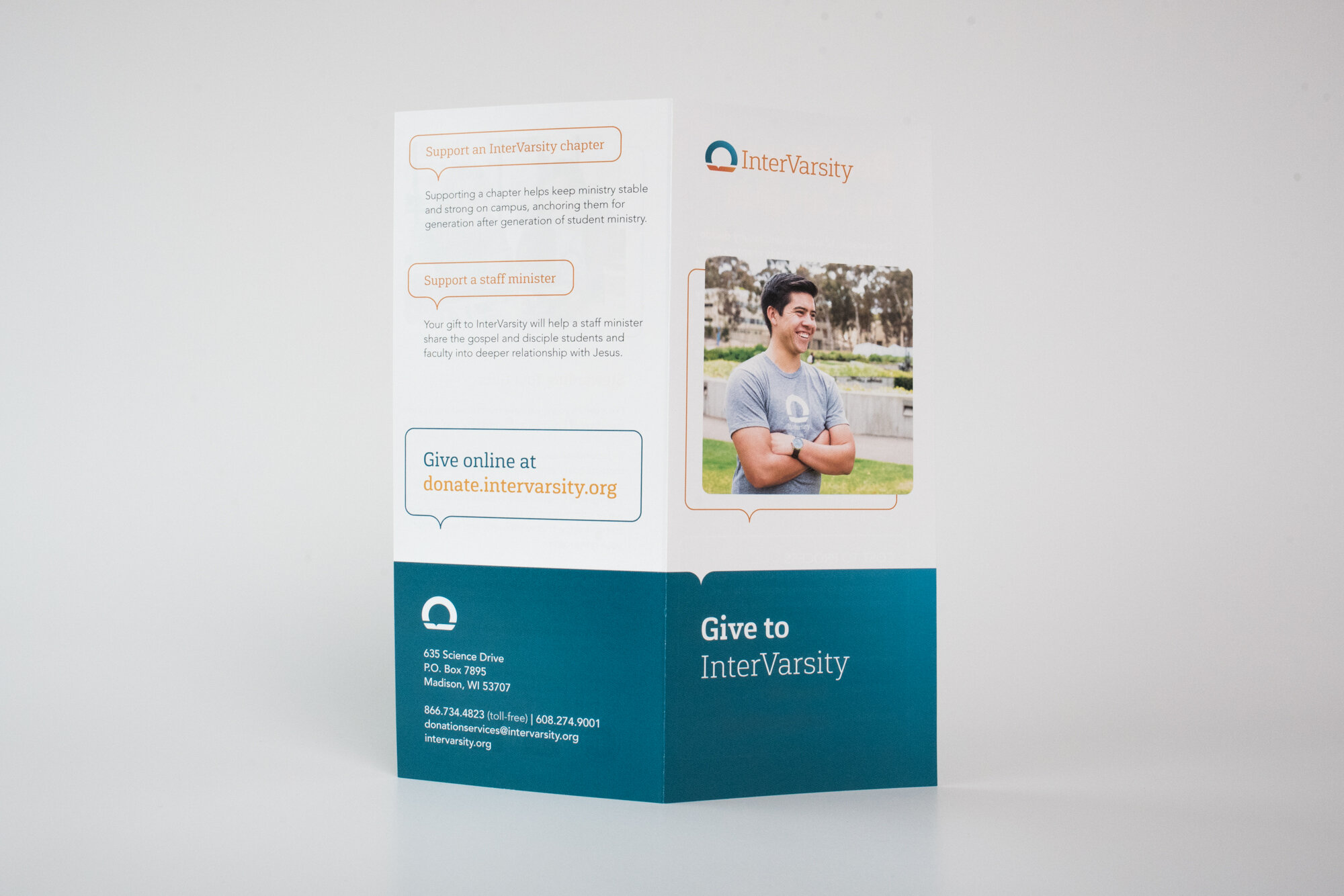
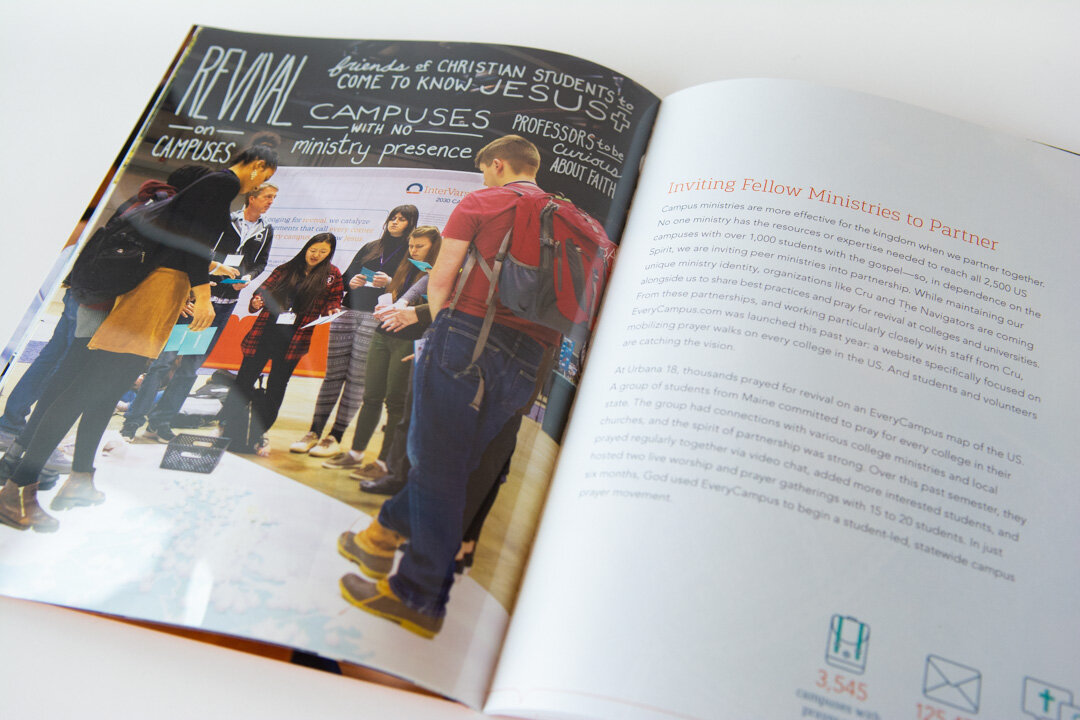
As part of our rebrand, we created a “commercial” featuring some of our students, along with a photo shoot that would provide images for our website, brochures, and other essential communication pieces. The imagery we captured further tells the story of transformation, real hope, and community that we aim to provide for all students on campus.


