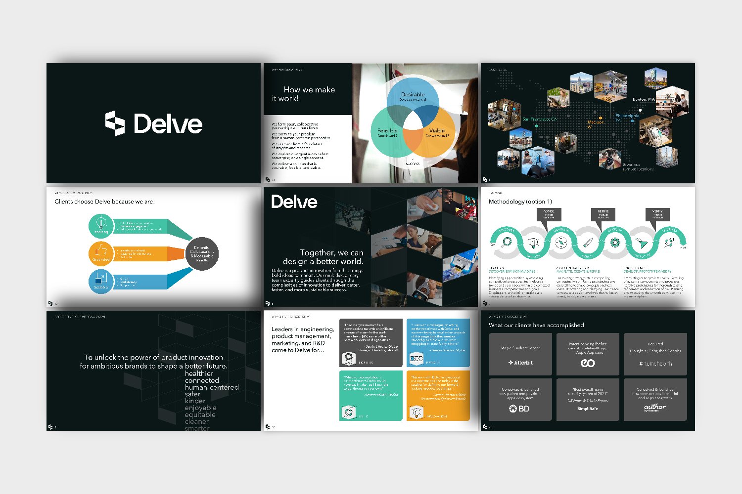
In 2022, I was hired to implement the rebrand of two merging product design firms.
Bresslergroup (based in Philadelphia) and Delve, formerly Design Concepts (based in Madison, Boston and San Francisco), were two small product design firms that had merged in 2021. After spending a year to integrate internally, they embarked on the full process of rebranding in early 2022. Leaders had decided to retain the name Delve as it aligned with their values and process, but to create a full visual rebrand that would feel like a new identity for the newly merged firm.
I was part of the internal team that spent three months working with the brand identity firm Mast to develop a logo identity. After finalizing the logo and basic brand assets, it was then my responsibility to create the full implementation of the brand across all communication channels.
Logo and Identity Development: Mast
Internal Design Team: Laura Li-Barbour, Lily Wolf, Jarrod Beglinger, Shelby Floyd
Consulting Directors: Corin Frost, Ken Soliva
Marketing Director and Project Manager: Andrew Averill
Executive Sponsor: Mathieu Turpault
Photography: Matthew Robinson
Animation: John Camalick
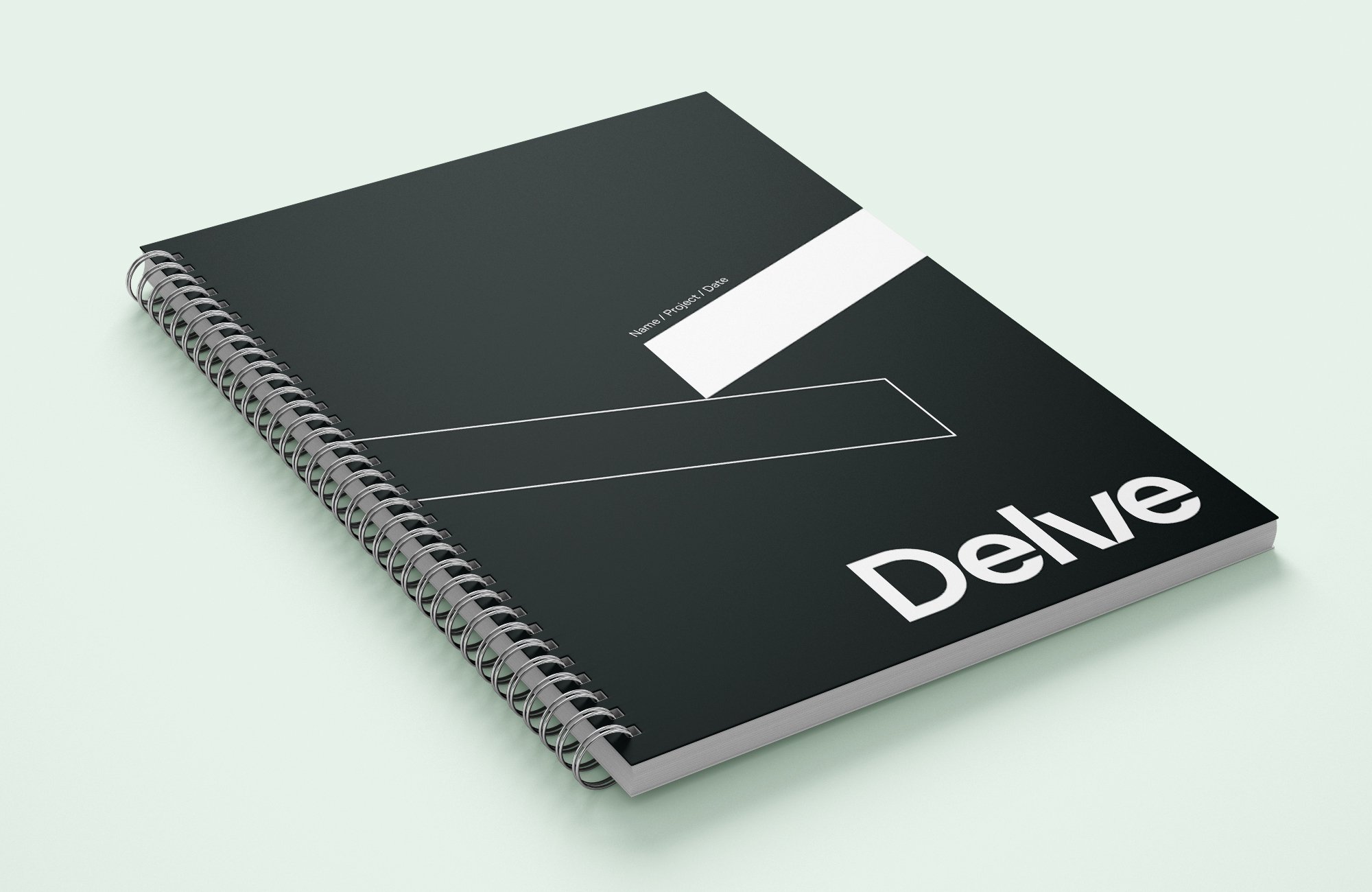
The opposing sides of our symbol portray how Delve expertly balances the tension between creativity and rigor, holistic and people-focused viewpoints, and boldness and pragmatism. It is also designed to blur the lines between physical and digital, a distinctive of Delve’s expertise in product development.
Paired with a simple yet bold wordmark that emphasizes the work of digging deep, our logo conveys the essence of Delve’s people and process.
As a consulting firm, Delve is often working in our clients’ visual brand space, which varies from medical device companies, to consumer household brands, to commercial and industrial businesses. Because of this, it was important to keep our color palette neutral and flexible. We chose to keep black, white, and gray as our dominant colors, so that when we needed to feature our clients’ distinct brand colors in presentations, our brand would not compete or clash with theirs.
However, color is still useful for a variety of applications, such as infographics and charts. So we developed a set of secondary and tertiary colors, as well as corresponding tints and shades, to use in these instances. The colors are named after gemstones, to represent the value that can be uncovered through the process of “digging deep.”
Our icon set is based on the grid formed by the geometric angles of our mark. By using these distinct angles, the icons have a unique look and feel that reinforces our overall brand. Our icons are also designed with flexible color and background shapes that help the icon stand alone when needed to act more as a mini illustration, but can also work as simple line icons when using several of them on a slide in a presentation, for example.





Our people are our product.
As a consulting firm, our people are what drives the business. Our passion, expertise, and empathy are what draw clients to work with us over and over again. We wanted our website and other marketing materials to highlight this, so I art directed a photo shoot to produce these images of real Delvians at work (and some play!) *PS: Yes, I was also in the photo shoot!


